This guide attempts to cover the technical aspects of photography that relate to painting realism. Unlike the Simple Guide on Taking Photos to Paint From and Simple Guide on Photographing Your Painting, this advanced guide is not a step-by-step walkthrough, but you will be able to use what you learn here to take photos of anything you want, as well as process your photos and make prints, with optimal results.
When painting realism, working from life instead of from a photograph is always ideal, but it's not always practical. If you are learning to paint for the first time using the course and videos on DrawMixPaint.com, we highly recommend painting from life instead of from photos. But at some point you may wish to use photographs as source material. Fortunately, with modern digital cameras, it is possible to take photos that reproduce natural colors very close to the colors you would see if you were painting from life. To do this, it is critical that you properly shoot, process, and print your photos — which is what this guide will teach you to do.
Each section will assume you have read and understood the previous sections. The best way to learn something is by doing it yourself, so it is recommended that you experiment with your camera as different settings and controls are explained in each section of the guide. Every camera is different, so if you can't find a control (button, dial, or menu) described in this guide, consult your camera's instruction manual, ask on the forum, or use Google.
If you have questions, you will usually get help quickly if you post them in the Draw Mix Paint Forum.
1 – Minimum Camera Requirements
Your camera must have a manual mode. This is the only camera mode that allows you to take full control of the exposure and other important settings. On your camera-mode dial, the M icon stands for Manual. This is the only camera mode you will be using.
While not required, it is extremely helpful to have a camera that can capture raw images (as opposed to JPEGs). By default, even cameras that have the ability to capture images in raw format are set to capture JPEGs instead, so you will need to find this setting in your camera menus and switch to raw format.
The requirements for the lens on your camera are different depending on what you're taking photos of. More information on lenses can be found in the Focal Length section. However, if you do not have the lens you need to take the photos you want, you can still learn to use your camera with the lens you currently have, and then switch to a new lens once you're confident with the other aspects of your photography.
If you would like to buy a new camera but don't know eactly what you want, a camera recommendation can be found in the Buying Guide section.
2 – Exposure Controls
Modern digital cameras tend to have a headache-inducing number of settings that make photography seem much more complicated than it really is. Fortunately, by shooting in raw format using Manual mode, there are only a handful of settings you need to know how to use, and of those settings, the most important are the three that affect exposure. They may sound complicated, but it's easy to experiment with them to see how they affect your photos.
2.1 – Shutter Speed
Shutter speed determines how long the camera shutter stays open to let light in when the trigger is pressed. The slower the shutter speed (in other words, the longer the shutter stays open), the brighter your exposure will be. So you can brighten your exposure by using a slower shutter speed, and you can darken your exposure by using a faster shutter speed.
The catch is, the shutter speed has one other effect: any movement that occurs while your shutter is open and letting light into the camera will cause motion blur. This could be movement in the scene you're photographing, or it could be movement of the camera if you're not using a tripod (or if your tripod is not sturdy). If you're using a tripod and photographing something that is completely still, like an inanimate object sitting on a table, you could use any shutter speed you want and there would be no motion blur. On the other hand, if you're taking a photograph of something with motion, like a pinwheel spinning, you would need to use a fast shutter speed to "freeze" the motion. Click here for a visual demonstration (in the linked image, the first pinwheel is captured at a high shutter speed, the middle pinwheel at a moderate shutter speed, and the last pinwheel at a slow shutter speed).
So slower shutter speeds brighten exposure and increase motion blur (if there is any movement), and faster shutter speeds darken exposure and decrease motion blur. Shutter speeds are measured in seconds — or, more often than not, fractions of a second. Some cameras abbreviate the fractions when noting the shutter speed, so a shutter speed of 1/30s (1/30th of a second) may simply be displayed as 30 for short, and a shutter speed of 1/250s (1/250th of a second) may be displayed as 250, and so on.
2.2 – Aperture
The aperture of a camera is similar to the pupil of the human eye. In the same way that your eyes' pupils can dilate and constrict to adjust to brighter or darker environments, cameras' apertures can widen or narrow to change the exposure. The wider the aperture, the brighter the exposure will be; the narrower the aperture, the darker the exposure will be.
As with shutter speed, there is a catch. In addition to affecting exposure, the aperture also determines the "depth of field" — how much of the scene is in focus. There is more information on this in the Focus section, but in short, a wider aperture decreases the amount of the scene in focus, and a narrower aperture increases the amount of the scene in focus. Click here for a visual demonstration.
So wider apertures brighten the exposure but decrease the depth of field, and narrower apertures darken the exposure but increase the depth of field. Aperture is measured in "f-numbers", with lower numbers corresponding to wider apertures and higher numbers corresponding to narrower apertures. For example, f/5.6 is a wider aperture than f/22. Sometimes cameras will note the aperture without using the "f/", so an aperture of f/8 may simply be displayed as 8 for short, and an aperture of f/2.8 may be displayed as 2.8, and so on.
2.3 – ISO
The ISO setting determines how sensitive the camera's sensor is to light. Increasing the ISO will produce a brighter exposure, and decreasing ISO will produce a darker exposure.
As with shutter speed and aperture, there is a catch, but it's a simple one: the higher the ISO, the more "noise" will appear in the captured image. Click here for a visual demonstration (the first image has a low ISO, the middle image a higher ISO, and the last image an even higher ISO).
So a higher ISO will brighten the image but increase noise, and a lower ISO will darken the image but decrease noise. That's it. Bear in mind that different cameras will produce different amounts of noise at different ISOs, and until you learn how much noise is produced at different ISOs, you won't know how bad the noise is until you enlarge your photos on a computer to full size.
2.4 – Using Shutter Speed, Aperture, and ISO Together
These three exposure controls — shutter speed, aperture, and ISO — are the only methods a camera can use to change exposure. Even on a fully-automatic camera, where the exposure is set automatically, it is these three settings that the camera automatically adjusts to achieve the exposure. Why not just have one control for exposure?
There are a few reasons. For one thing, from an artistic standpoint — and I mean the art of photography, not the art of painting — there are different effects you can achieve with the different exposure controls that may be desirable to the photographer. For example, click here to see a photo with a "light trail" effect.
That effect is achieved by using a very slow shutter speed while the camera is mounted on a tripod. The background of the scene — the roads and the buildings — don't move, so even with the slow shutter speed, they're sharp and don't have any motion blur. But the cars driving on the roads are moving fast, and the red lights on the back of the cars are very bright. With the slow shutter speed, the shutter is open while the cars move long distances, and bright lights of the cars leave trails in the image. You don't see the cars themselves because, besides their lights, they're too dark to leave an impression while they're moving across the image.
So for that photo, it was a requirement that the shutter speed be very slow. If the exposure needed to be darkened, the photographer wouldn't be able to use a faster shutter speed to darken the exposure because then they wouldn't get the light trails they wanted. Instead, they could adjust the aperture to darken their exposure, leaving the shutter speed at the slow speed they required.
Click here for another example. In this photo, the photographer wanted an image where both the foreground and the background — everything, basically — was in acceptable focus, even though the distances between the foreground and background are huge.
This is called "deep focus". To achieve this, the aperture needs to be very narrow (higher f-numbers). Because everything in this particular scene is very still and the camera is mounted on a tripod, the shutter speed can be set to anything the photographer wants and there won't be any motion blur. So if the photographer needed to brighten the exposure, they wouldn't be able to widen their aperture without losing the deep focus effect. Instead, they could adjust the shutter speed.
In these two examples, the photographers were dealing with the two variables you will most commonly be dealing with when adjusting exposure: how much range is in focus, and how much motion blur there is. There is also a third variable, the noise that comes from high ISO settings. Less noise is always better, but it's normal to have some noise in photos, so it's simply a matter of how much noise you can tolerate in your image.
Generally, the most common problem a photographer has to solve is what to do with the amount of light they have. For the purposes of painting realism — whether it's taking a photo to paint from or taking a photo of a painting — you're trying to avoid photographic effects like motion blur or out-of-focus subjects. This simplifies things a lot. For example, if you're taking a photo of a still-life and the objects in the front and the objects in the back aren't all in focus, you need to make your aperture more narrow. There's no decision-making necessary, because you know, as a rule, that you need to have everything in focus if possible. So you know the aperture needs to be more narrow, so you take the photo again with a more narrow aperture. So if you need to brighten your exposure, and you can't widen your aperture to achieve that, what setting do you adjust? Shutter speed and/or ISO.
What if you're taking a photo of a model for a portrait? You might take one photo, enlarge it on your computer, and notice that the model has some motion blur. This is totally normal, because even professional models can't be perfectly still. To get rid of motion blur, you need to increase your shutter speed. So you go back to take another photo, and if you need to brighten your exposure, you know you can't do it with shutter speed because of the motion blur problem. So what setting do you change to adjust exposure? Aperture and/or ISO.
Let's stick with the same example. So you already adjusted your shutter speed as slow as it can go without causing motion blur, and then you went back and took another photo using aperture to brighten your exposure. This time, when you enlarge the image on your computer, you notice that the tip of the model's nose is in focus but the model's ears are not. What's the problem? The aperture must be too wide to get both the nose (closer to the camera) and the ears (further from the camera) in focus at the same time. So now we have to narrow the aperture to fix the focus problem, which makes our exposure too dark again. Now both shutter speed and aperture are off-limits as far as brightening the exposure, so what do you do? You use ISO to brighten the exposure. Besides moving the model into a brighter area for the photo shoot, ISO is your only option at this point.
When you first start practicing with your camera, you might follow this procedure more or less as written. You'll take a photograph, put it on your computer, find a problem, and then go retake the photo fixing that problem… and in the very beginning, you might even repeat this process a few times until you've sorted out all the problems and are left with a good photograph. But soon enough, you will not need to do this. You will have practiced enough to know, for example, that you think an ISO of 1600 is too noisy based on experience, and so you will never turn the ISO up higher than 1600. You will have practiced enough to know that, for another example, when you're taking a photo of a model, you sometimes get motion blur if the shutter speed is slower than 1/30s, and so you will never use shutter speeds slower than 1/30s when photographing a person. There are only three controls — shutter speed, aperture, and ISO — and you will quickly learn what settings cause which problems in various situations. All cameras are the same in this regard: learn these three controls, get comfortable with them, and then the "hard" part is over. If you have a manual camera and some free time, that's all you need to master the exposure controls.
General guidelines for different scenarios (still-lifes, landscapes, portraits, etc) will be discussed in the Guidelines for Typical Scenarios section.
2.5 – Other Exposure-Related Settings
There are a number of other camera feature and functions that can interfere with the exposure. The most obvious are the automatic modes, "priority" modes, and "scene" modes (also called "picture styles" and other proprietary names). Automatic mode and Program Mode have the camera automatically determine the shutter speed, aperture, and ISO to achieve an exposure. Shutter-priority mode (also known as Time-value mode) allows you to select the shutter speed, but the camera automatically selects the aperture to achieve an automatic exposure. Aperture-priority mode (also known as Aperture-value mode) allows you to select the aperture, but the camera automatically selects the shutter speed to achieve an automatic exposure. Scene modes are automatic modes with arbitrary filters applied to the image (for example, Landscape mode exaggerates saturation of greens and blues).
All of this complicated mode business is irrelevant. If you want your camera to determine exposure and other settings automatically, you might as well buy a cheap point-&-shoot camera. A camera is a tool, and you are the photographer. In order to get good accurate photos consistently, you need to be the one adjusting the settings — not your camera, which gets the settings very wrong more often than not. So set your camera on Manual mode and then forget the mode dial altogether.
But what about all these other features in the camera menus? They're different on every camera, but for example, Canon has a feature on some cameras called "Auto Lighting Optimizer" (or ALO). Nikon has the same feature but calls it "Adaptive D-Lighting". Basically, what they do is try to adjust the image so that the shadows are lightened while affecting the rest of the image as little as possible (I only know this because I looked it up online). So, in effect, this feature is automatically adjusting part of your exposure for you, which you don't want. There are dozens of features like this, many with confusing names, and different cameras will have different ones. Some of them will be off by default, while others will be on by default.
Good news, though. When shooting in raw format, the effects of these features are only visible while looking at your image on the camera. Once you open the raw image file in Adobe Lightroom or Adobe Photoshop (more on them in the Processing section), all of these adjustments and "enhancements" will disappear. Lightroom and Photoshop will instead show the unaltered version of your raw image. So, if you want, you can look up any settings on your camera that you don't understand one by one and disable the ones that alter your image, giving you a more accurate preview of your images on your camera… but you don't need to do this if you're shooting in raw. Only JPEGs are permanently affected by these kinds of settings.
To avoid the headache, shoot in raw and don't worry about it. This is one of the many reasons to shoot in raw format. By shooting raw images in Manual mode, you're essentially making your camera much, much simpler, and don't have to worry about your camera messing up your properly exposed images.
2.6 – Flash
Turn it off and leave it off. Always. There are times when flash is appropriate, but not when taking photos to paint from or taking photos of paintings. Never ever use the flash.
2.7 – Bracketing
Bracketing is a technique where instead of taking a single exposure, you take multiple exposures to ensure you have a good exposure to choose from. Shooting in raw format allows you to adjust the exposure to an extent when you're processing the images on your computer, but it's best to have something as close as possible to the correct exposure to start with. To bracket manually, simply expose the shot so that it's definitely way too dark, and then brighten the exposure one click and take another shot, and repeat the process until you've taken a photo that definitely too bright. Somewhere in this process you will have gotten a good exposure.
After you grow accustomed to your camera and have some practice taking photographs, you will not need to bracket so much. Instead of starting with an exposure that is way too dark and finishing with an exposure that is way too bright, you would just start with an exposure that you know is a little bit too dark and finish with an exposure that is a little bit too bright. This is a good habit to get into until you're comfortable enough with your camera that you know what the right exposure is, which is sometimes hard to determine just by looking at the camera display.
Some cameras have a mode that automatically brackets for you, which you can usually configure to take a certain range of exposures darker and brighter than the exposure you explicitly select before pressing the trigger. Sometimes this requires holding down the trigger until all the exposures have been taken. Feel free to use this mode if you prefer.
2.8 – What is a "Good Exposure"?
In a well-exposed image, there are no "blown out highlights" (areas of the image which are overexposed and thus appear white). Even white objects or white surfaces in direct light — for example, a white porcelain cup — should not appear pure white in the final image. The one exception is perhaps small reflections of the light source (the shine on a silver spoon, for example). It is very typical in modern photography for photos to be overexposed, but if you look at any good realist painting created before the advent of photography, you will find that the artist did not paint any large areas of the painting to be pure white. Keep in mind that even photos of these old paintings are usually overexposed, and computer monitors are not usually calibrated properly, so you really need to look at the actual paintings in person to get a feel for the difference between the "exposure" in old paintings and the typical photograph of today. There are many reasons why photography has tended towards brighter and brighter exposures, but that is beyond the scope of this guide.
Please watch the first fifteen minutes of the video below, which provides many examples of good and bad exposures with detailed analysis and advice on how to get a good exposure:
So a good exposure should not have areas of the image which are "blown out" to white (except perhaps small reflections in some cases), but on the other hand, it is completely normal for areas of the image to fade into black, or even disappear entirely into black. So when choosing an exposure for scene, it is important to expose not for the shadows and darker areas of the image, but for the highlights (the brighter areas of an images). If the shadows are dark or even pitch black, that's okay.
There is another reason to expose for the highlights rather than the shadows. Later in this guide, I will be covering how to process your photos on the computer in preparation for printing. If you are shooting raw images (rather than JPEGs), when you process your image you can always pull detail out of your shadows, but any sufficiently overexposed area of your image will not be recoverable. Blown out highlights are "burned out" so to speak and there is no image data left in them. There is no color, no texture, nothing. So it is always better to err on the side of underexposing an image rather than overexposing it, because an underexposed image can almost always be corrected in post-processing on your computer, but an overexposed image often cannot be fixed and must be shot again.
So what do you do when photographing a scene with a very large range of values? For example, a sunset where the sky is bright and colorful but the foreground is dark? If you expose for the highlights in this case (the sky), the foreground might be completely black — even too underexposed to fix on the computer later. But if you expose for the foreground, then the colorful sky will not be colorful — instead, it will come out as pure white, and you won't be able to see any texture in the clouds. Another problematic example: you want to paint a room indoors, but there is a window to the outside that is much brighter than the interior. I cover both of these situations in a later section of this guide, "Scenes with High Contrast".
3 – Important Controls That Don't Affect Exposure
There are three important controls that don't affect exposure. You're probably already familiar with two of them: focus and focal length (how "zoomed in" your view is). The third control, white balance, is less well-known, but when shooting in raw format, it is very easy to manage.
3.1 – Focus
At any given focus setting, the image a camera captures is only perfectly sharp (in focus) at a precise distance from the camera lens. In other words, you could set the focus so that anything exactly two meters in front of you is in focus, and anything in the shot that is slightly closer or slightly further than two meters from you will be slightly out of focus, and anything in the shot that is much closer or much further than two meters will be even more out of focus, and so on. That's a technicality, however… an object doesn't need to be in perfect focus in order to be focused reasonably well, otherwise it would be impossible to take decent photographs!
So really what you're dealing with is a range of acceptable focus. Anything inside that range is considered in focus, and anything outside that range is considered out of focus. The difference is obvious — if you enlarge the image on your computer and one object appears perfectly sharp and another object appears blurrier, then the blurry object is out of focus. It's not any more complicated than that.
But you'll notice that some photos have objects that are significantly different distances from the camera that are both in focus, while other photos have objects that are only slightly different distances from the camera where one object is in focus and the other is not. The difference is a result of something called "depth of field". A shallow depth of field means that the acceptable focus range is small, while a deep depth of field means that the acceptable focus range is big.
There are a few things that affect the depth of field. The most obvious is aperture. You can change how shallow or deep the depth of field is by changing the aperture. Wider apertures (lower f-numbers) produce a shallower depth of field, while narrower apertures (higher f-numbers) produce a deeper depth of field. Different lenses have different ranges of f-numbers available. For the purposes of painting realism, there are no circumstances where you require a shallow depth of field. On the other hand, for landscape photography, where there large distances between various objects in the scene, having the ability to use a deep depth of field is very useful.
Two other things that affect depth of field are distance and focal length. As for distance: when your plane of focus is close to the camera, like when you're taking a photo of a flower a few feet in front of you, you will have a shallower depth of field than you would if you were focusing on a something far away, like a tree in the distance. This is fortunate for landscape photographers, who need deep depth of field. In fact, once the focus is set far enough away, the depth of field extends infinitely far away (which is why you might see an infinity symbol on your camera or lens when adjusting focus). The other thing that can affect depth of field is the focal length, discussed in the next section.
3.2 – Focal Length
Depending on how close or far away something is from you, it looks different because your perspective is changing. Of course things that are further away look smaller, but even if you were to magnify the subject from a distance with a telescope, it would appear differently than it does if you were up close to it. Click here for an example, and Click here here for another.
Focal length is how much a lens magnifies the image. A wide-angle lens has a short focal length, while a telescope has a long focal length. The focal length determines how much you can see of a scene (called the angle of view) as well as how large the objects in the scene are in the image (the magnification). When you see nature docomentaries with close-ups of birds, the photographer is using a lens with a long focal length so the images of the birds are large without the photographer needing to get close to the bird. On the other hand, when you see travel documentaries, it's not uncommon for scenes of walking around urban areas to be shot with a wide-angle lens, so the viewer can see more of the environment around the host of the show.
So if you have a zoom lens, when you zoom in you're increasing the focal length, and when you zoom out, you're decreasing the focal length. Some lenses, called prime lenses, cannot be zoomed and are set at a constant focal length. Zoom lenses have a range of focal lengths they can zoom through, with different zoom lenses offering different ranges of focal lengths.
Because changing focal lengths allows you to alter the apparent size of objects in your image by magnifying them (zooming in) or demagnifying them (zooming out) without you having to move physically closer or further from the subject, the resulting photo can have what's called perspective distortion. In the case of telescopic perspective distortion, it results from the fact that the magnified image is just a small crop of what your naked eyes see; in the case of wide-angle perspective distortion, it results from the lens warping the scene in order to fit more of it into the image. Click here to see what happens when taking headshots with short focal lengths (the last four images show a wide focal length, a wider focal length, a very wide focal length, and then, for comparison, the last image is a long focal length). And just a side note: the photos in that image are severely overexposed.
This distortion changes the relative sizes of objects (click here for an obvious example) as well as the angle each part of the scene is viewed from. A wide variety of artistic effects can be produced by taking advantage of these distortions, but for the purposes of taking realistic photos to paint from, it is important to avoid certain distortions in certain situations — assuming you do not want your painting to exhibit photographic distortions.
So let's discuss the practical side of all this in the context of painting realism. Focal lengths are measured in millimeters. Focal lengths ranging from roughly 40mm to 60mm are considered "normal lenses", with focal lengths shorter than that being considered wide-angle lenses, and focal lengths longer than that being considered long-focus lenses (more typically, telephoto lenses). So a 14mm lens is an example of a wide-angle lens and a 200mm lens is an example of a telephoto lens. A zoom lens may cover only wide-angle focal lengths, or it may cover only telephoto focal lengths, or it may cover some of both.
For the purposes of painting realism, wide angles should be avoided in general. For example, in the case of portraits, they will force you to move too close to the subject, which causes distortions which are not only unflattering (evident from many "selfies" on the Internet), but also cause other more complicated problems, discussed in more detail in the Portraits and Foreshortening sections. In the case of still-lifes, taking the photo from too close gives a significantly different perspective than you would get if you stood further away. Since people viewing your eventual painting will be viewing it from a moderate distance, if you paint from a wide-angle image, it may look weird to viewers. With landscapes, sufficiently wide-angle shots will exhibit major geometrical distortions towards the edges of the image — for example, buildings or trees bending and warping unnaturally — in addition to changing the apparent relative size of objects. In the telephoto example of the moon shown earlier in this section, the moon appeared too large, but wide-angle lenses do the opposite, and would make the moon appear too small relative to other objects in the scene.
Telephoto lenses (long focal lengths) are more useful for us. We have discussed some of the distortions that can be caused by long focal lengths, but in practice these distortions are less of a problem in many situations. For example, when taking a photo of a painting, a long focal length is actually desired (more on this in the Photographing a Painting section). With portrait photography, they allow you to get a close-up (magnified) shot of the face while also getting a shot of the model's full body without physically moving closer or further from the model (which is critical, as physically moving would change perspective).
Meanwhile, "normal" lenses are more or less, well, normal. Distortions are not significant. Relative sizes of objects are close to what your naked eye would see. What lens you use for what situations — wide-angle, normal, or telephoto; zoom or prime — is up to you. But it's important to be aware that in addition to making things bigger or smaller, there are side-effects, and they will carry over into your paintings.
There is one major complication to all this focal length stuff, and this is extremely important to be aware before you start shopping for lenses or taking photographs using the focal length guidelines given here. The complication is this: the effects of focal length are determined not only by the focal length of the lens, but also the size of the sensor in your camera. When discussing focal lengths, people are generally referring to the "35mm equivalent" focal length of a lens. In other words, when we defined a "normal lens" as a lens in the 40mm to 60mm range, that was assuming the lens was on a 35mm film camera or a full-frame (35mm sensor) camera. You can read more about that by clicking here. If you put a 50mm lens on a camera with a smaller sensor, the 35mm-equivalent focal length would actually be significantly higher than 50mm. For example, in our studio we have a camera with a sensor that doubles the 35mm-equivalent focal length of any attached lens, so our 14–42mm lens actually behaves like a 28–84mm lens. This multiplication required to figure out what the "actual" focal length range of a lens would be on our camera is called the crop factor (also called the field of view crop, magnification factor, focal length factor, or focal length multiplier).
This is all confusing, so please, be very careful when buying lenses for a camera, and make sure you know what your crop factor is, and whether or not the lens is being advertised with it's actual focal length or the 35mm-equivalent focal length of that lens paired with a particular camera. If you're unable to find the information you need online to determine these things for certain, ask someone knowledgable at a camera shop or post your questions on the Draw Mix Paint Forum before making any purchase decisions.
One last thing about focal length: the longer your focal length, the more susceptible your shot will be to motion blur caused by hand movement. This is because in addition to magnifying the image, the focal length is also magnifiying the motion blur, so it is recommended that you use a tripod when using longer focal lengths. More information on using a tripod can be found in the Using a Tripod section. Also note that when changing focal lengths (zooming in or zooming out), some lenses do not maintain the focus you set, so until you're sure this isn't an issue with your lens, be sure to set your focus after zooming in or out or your images will be out of focus!
3.3 – White Balance
If you've painted a few paintings using the Draw Mix Paint method, you're probably aware of the fact that the color we perceive in an object is determined not only by the physical object itself, but also by the light hitting the object. In other words, a white piece of paper under orange light is not actually pure white, but an orange color; a white piece of paper under a blue light is not actually pure white, but a blue color. We call this difference in the color of the light "color temperature". Click here for a visual demonstration.
Our eyes and our brains do many amazing things, and one of them is handling this issue of different color temperatures seamlessly. That's why, in person, we can see that a white piece of paper is white, regardless of whether we're outside when the sun is setting, or in a room with fluorescent lights, or whatever, and it feels consistent. Our optical system is incredibly good at this and has capabilities that cameras simply don't. For one thing, our eyes can adapt to a wide range of color temperatures, dynamically covering a range of colors that simply can't be reproduced 1:1 with prints or computer displays.
The solution to this problem is a setting called white balance. By default, this is generally set on automatic mode, which attempts to figure out what color the light is and compensate for it automatically. Unfortunately, it is not possible for a camera to determine the color of the light accurately all by itself. For example, if you take a photograph of blue wall, the camera has no way of knowing for sure if the wall is a strong blue color, or if it's simply a white wall in blue light, or somewhere in between… so it guesses. Sometimes this works out okay, but sometimes it doesn't.
If you're thinking "oh great, another setting I have to worry about", good news! You don't. Not when you're taking photos, anyway. When taking photos in JPEG format, the white balance is hard-coded into the image and there is no way to change it later. But when shooting in raw format, you can easily change the white balance later when you're processing the images on your computer. So yes, if you're shooting in raw format, you can leave the white balance setting on your camera in automatic mode! The color temperature might look wrong on the camera when previewing the photos you've taken, but you will be able to fix them once they're on the computer.
When adjusting white balance, there are two ways you can do it: you can do it intuitively, adjusting the white balance however you see fit; or, you can use a tool called a gray card. We will get into the details of the easy process of actually adjusting the white balance in the Processing Photographs on the Computer section, but let's take a moment to discuss what a gray card does and how to use it during a photoshoot.
A gray card is special piece of plastic, paper, or foam that is a neutral gray color. Because this neutral gray is a widely-accepted standard, when you take a photo of it in any given light, cameras and photo-processing software can determine the color temperature of the light because they know exactly what color the gray card is. All you have to do is tell the software that yes, that card is that special neutral gray color.
What the software will do then, is set the white balance to the exact color temperature of the light. This will make the gray card appear perfectly neutral gray, and it will make, for example, a white piece of paper look white, like in the white balanced image shown earlier in this section. So if you take, say, a hundred photographs in the same light (for example, outside on a sunny day), all you need to do is take a single photo in that same light with the gray card. The card doesn't even need to be in focus, you can just hold it out in front of the lens, making sure the light is hitting the front of the card, and then take a quick photo.
When you process the photo on the computer later, you can use this photo to get your white balance setting and apply it to all a hundred photos you took during the photoshoot.
There are a couple things to be aware of. First, a gray card will not work if the photo of it is too overexposed or underexposed. That's because when you overexpose or underexpose something too much, the color goes away in the image, and if the color is gone from the gray card, it obviously can't do its job. So while it's okay for your gray card shot to be out of focus, you do need to make sure the gray card is exposed more or less properly.
Secondly, when you neutralize the white balance with a gray card, you are effectively neutralizing the color temperature of the light. That means if you took a photo of someone with a warm, orange light shining on them, and then you took the exact same photo but switched the light bulb out for a pure white light, after balancing the photos with a gray card, they will appear exactly the same. It would be as if the warm orange light was white! Think about that: if you had some wonderful, moody photographs of a beach at sunset, and you neutralized the color temperature with a gray card, it wouldn't look like a sunset at all. All the warm oranges and reds from the setting sun would be gone.
So why adjust the white balance at all? Why not set the camera for true neutral (daylight color) and allow all those extreme colors, like the oranges of a sunset, to come through? The problem is, while our eyes can adapt to such extreme changes in color temperature, there are limits to what prints and computer displays can render. For example, click here.
That shot was taken under very yellow street lights. In person, with the naked eye, that scene looks fine. It's warm, but it certainly doesn't look like the image above. That photo was taken with the camera's white balance set to "daylight", which we'll consider neutral. The difference between daylight and the color temperature of the scene was just too extreme to replicate 1:1. But if we neutralize it completely, it doesn't have the flavor of the light anymore. Click here to see a "corrected" version of the photo.
So now the light doesn't look the slightest bit yellow, even though the scene was shot under very yellow lights. The solution? A compromise between the two. Use a gray card to determine the color temperature, which neutralizes it in the photo processing software. Then adjust the white balance back towards daylight until it looks correct or pleasing to you.
That's all you have to do. So instead of using a gray card to kill the color temperature, you're just using it to find out what the color temperature is, and then deciding on your own, using your own artistic sense of what looks good and right, how much of the light color to leave in and how much to take out.
Don't want to use a gray card? You don't have to. You can do all of this manually, guessing about the color temperature or even making the color temperature up as you see fit. As long as you shoot in raw, you don't have to worry about it. A gray card is just a tool you can choose to use if you find that it helps you get better photographs, or if accuracy is important to you.
So when using your camera, you generally don't need to worry about white balance at all, but can use a gray card if you'd like. Information on actually adjusting the white balance in post-processing is available in the Processing section.
4 – Using a Tripod (and Not Using a Tripod)
Ideally you will want to use a tripod whenever you can. A tripod can eliminate all camera movement, which is simply not possible when hand-holding a camera, even if you're a professional camera operator. When taking photos of inanimate objects, as is the case with a still life, the camera movement is the only movement, and so that's where all the motion blur comes from. By using a tripod in a situation like that, you eliminate all possibility of motion blur, no matter what shutter speed you use.
In the case of photographing a portrait, even though the subject does move ever so slightly and this will create motion blur at slower shutter speeds, you can still set the shutter speed slower than you would be able to if you were hand-holding the camera. This is always a good thing because light is often limited, so the slower shutter speed a tripod affords you is basically "free exposure". So a tripod enables better low-light performance as well as consistency from shot to shot, and prevents accidental hand movement from ruining an image with motion blur.
Even with the camera on a tripod, you can still move the camera while the shot is being taken accidentally. To avoid this, make sure the tripod is sturdy and stable, and try to move the camera as little as possible when pressing the trigger. Even better, use a remote shutter release (corded or wireless) instead of pressing the normal trigger button on the camera. Another method you can use is to set a delayed shutter. For example, if you set your camera to take a shot two seconds after you press the trigger, that will give the camera time to settle from any vibrations or movement caused when you press the trigger button.
When not using a tripod — because realistically, sometimes you need to take a photo and don't have a tripod available — you can either use an improvised tripod (a small table with a stack of books to set the camera on, for example), or you can engage the optical image stabilization feature of your camera or lens, if available. Image stabilization uses electromagnets and gyroscopes to help steady the image. It is designed to compensate for small unintentional movements. It's effectiveness is limited, but it will allow you to use a slightly slower shutter speed than you would without the feature enabled.
One quirk of this feature is that depending on the system, sometimes it can cause problems if the camera actually is completely still, meaning that if you are using a tripod, you should disable the image stabilization feature just in case.
While travelling, if you don't want to lug a tripod around and set it up and break it down after every photo opportunity, consider getting a monopod. They're not as stable as tripods, but a monopod is still a big improvement over hand-holding, while also being smaller, lighter, and easier to deploy than a tripod.
5 – Guidelines for Typical Scenarios
Here are some general guidelines for common photography scenarios. This section assumes you have read and understood the previous sections. Remember, these are just guidelines — not rules.
5.1 – Still Lifes
Because a still life is perfectly still, if you use a tripod you can use any shutter speed and not get motion blur, so use this as your primary means of adjusting exposure. Make sure your aperture is narrow enough (higher f-numbers) so that the entire still life is in focus, and set your ISO to the lowest setting available so that your photo will be virtually noise-free. Do not use a wide focal length — use a "normal" focal length or a slightly longer focal length, otherwise you will move too close to the still-life and cause noticeable perspective distortion. Because your aperture will be narrow and your ISO will be low, your shutter speed will most likely be very slow, so be extra careful not to move the camera while the photo is being taken to avoid motion blur, and use a sturdy tripod with the camera mounted firmly onto it.
Note that very high f-numbers (very narrow apertures) can produce a type of blur called "diffraction blur". This is not the same thing as the blur caused by something not being in focus, and is generally not an issue when taking photos to paint from as you do not need ultra-sharp reference photos. Different lenses will perform differently, so you will need to experiment with narrower apertures and inspect your results on a computer (where you can blow the images up to full size) to determine how narrow you can set your aperture before diffraction blur becomes an issue.
5.2 – Landscapes
If the landscape is perfectly still, you can follow the exact same guidelines given for still-lifes in the previous section. If you cannot get everything in focus with a single shot, even with the aperture set very high, you may need to take multiple photos from the exact same position, focusing at different distances. When painting, you can select the print where the area you're painting is in focus, and when you move onto something that is not in focus in your current print, you can switch your print out.
If the landscape has elements that are not perfectly still, like trees swaying in the wind, then you will need to use a shutter speed that does not produce motion blur. You can use trial and error — take a photo with a certain shutter speed, then go to the preview of the image on your camera and enlarge the area with movement to look for motion blur. If there is motion blur, use a faster shutter speed and check again. You will eventually get a sense of how much movement a given shutter speed can tolerate before causing motion blur.
Once you determine an acceptable shutter speed, you will probably need to adjust your other exposure controls — aperture and ISO — to get the correct exposure. Remember that with landscapes, aperture is important because it controls the depth of field, and landscapes tend to require deep depths of field. At the same time, don't forget that an excessively high ISO will produce more noise in the image than you might like. To determine what an "excessive" ISO setting is, you will need to experiment.
Many people prefer to take photographs of landscapes with wide-angle lenses. It is up to you to determine whether or not this makes a given photograph look unnatural or not. For many scenes, it may be okay, and for others, it may cause noticeable distortion in parts of the image.
5.3 – Portraits
For portraits, you should be at least six feet away from the subject for head-&-shoulders portraits, and at least ten feet away from the subject for three-quarter-length portraits. This will require a lens with a 35mm-equivalent focal length of approximately 70mm in order to get the entire head-&-shoulders or three-quarter-length areas of the subject in the frame, although a focal length up to around 100mm is okay as well (you will just have to stand further away).
For life-sized full-length portraits there is a phenomenon called "foreshortening" that can cause serious problems in your finished painting. More information on foreshortening can be found in the Foreshortening section, but to deal with this issue, you will need to avoid taking full-length portrait photographs with a 35mm-equivalent focal length shorter than about 70mm or 80mm. This will require you to stand about fifteen feet away from the subject in order to capture their full body. Be sure to have the camera at the same height as the subject's eyes, then tilt the camera down so that their head is near the top of the photo and their feet are near the bottom.
For life-sized three-quarter-length and full-length portraits, you should get zoomed-in photos of the face, hands, and any other areas where you need to see lots of fine detail, in addition to the full-body shots. When taking all these photos, it is extremely important that you not pick up the tripod and move the camera to a different position, as this will change perspective. So a zoom lens would be ideal, otherwise you will need multiple lenses, as you cannot move closer or further from the subject to get the different shots. The zoom lens should have a range starting from 70mm or 80mm going all the way up past at least 100mm.
Depending on how high the resolution on your camera is, you may be able to get away with a 100mm focal length for the zoomed-in close-up shots because, even though the face or the hands or whatever will not fill the entire frame, there is more resolution in the photos so you will still be able to enlarge the image to life-size in post-processing without losing too much detail. However, many cameras do not have the necessary resolution, and in that case you will want to zoom in so that the head is filling most of the frame. To do that, you will need higher focal lengths. This is why having a zoom lens with a 35mm-equivalent of 70–200mm (for example) is fantastic for photographing full-length portraits if you will be painting life-sized paintings from them. With a single lens that has a 35mm-equivalent focal length like that when attached to your camera, you would easily be able to get both the full-body and close-up shots you needed from about fifteen feet away (a little further away if the subject is relatively tall and standing upright).
When photographing subjects for a portrait, it is common to try taking photos in different areas. Be sure to set your focus every time you move, and be sure that you remember to focus after, not before, adjusting focal length (zooming in or out), unless you have already determined that your lens maintains focus precisely when zooming.
5.4 – Scenes with Significant Motion
Scenes with fast motion will require very fast shutter speeds. This will limit your exposure control options to aperture and ISO primarily. If your shutter speed is as slow as it can go without creating motion blur, and your ISO as high as you're comfortable setting it, this will leave you with just aperture to brighten the exposure if necessary. If you widen the aperture significantly to get a brighter exposure, your depth of field will also be decreasing. Depending on what you're shooting, this may or may not be a problem.
For example, if your subject is a person dancing, you shouldn't have to narrow the aperture too much to get their entire body in focus. On the other hand, if you're shooting a city scene, you might need a very narrow aperture to get the depth of field you need (again, depending on the scene). If you run out of options, you may simply have to raise the ISO beyond what you would like, and then use post-processing software to attempt to reduce the noise, although this isn't ideal. Sometimes, there just isn't enough light available to capture the photograph you want to capture. If you're indoors and can adjust the lighting in the room, that is the best option. If you're outdoors, you can try taking the photographs at a different time of day when more light is available.
5.5 – Scenes with High Contrast
The range of values (from dark to bright) that you can see in real life is far, far greater than the range of values that can be represented in a photograph destined for print. Just like with paint, the darkest value a printer can produce is black ink, and the brightest value a printer can produce is white ink (or just letting the white paper show through). Current computer monitors, television sets, etc are also limited in this regard. This is why in a given scene, in real life you might be able to see into all the shadows in the scene, but in a properly exposed photograph of the same scene, those shadow areas may be rendered as black ink. Anything darker than the range that can be rendered is printed as black, and anything brighter than the range that can be rendered is printed white. This is simply a limitation of the medium, and it's the same limitation painters have dealt with throughout history. Painters in the old days handled the problem exactly the same way we do now: by "exposing" for the highlights (that means not overexposing them) and allowing the darker elements of the scene go black. It just works — it produces images which look correct.
There are limitations to what you can render in a painting or a photograph, but some people with lots of experience and an intimate understanding of photography bend the rules with good results. By shooting in raw format and/or taking multiple photos of the same scene, they are able to manipulate the photograph in post-processing to good effect. Small adjustments are easy with raw images — with software like Lightroom and Photoshop, it is not hard to slightly adjust shadow values or highlight values in a raw image without making the image look unnatural. However, beyond minor adjustments, it is very easy to get carried away and ruin an image, so be careful when you make adjustments, and occasionally revert to the original image to see if you're changing anything you are not intending to.
There are certain specific situations where solving the high-contrast problem is not so difficult. For example, if you have two very distinct areas of an image, one which is bright and one which is dark, you can use different exposures for those different areas when painting. If it's bright outside and you take a photo indoors, and there's a window to the outside in your shot, you can bracket your exposures so that you have good exposures of both the indoors and the outdoors. When you paint, you would use the good exposure of the indoors to paint the indoor parts of the painting, and you would use the good exposure of the outside to paint the window portion of the painting. It would be up to you to select the two exposures that, when used together, make the effect work.
Another example would be a landscape where you can't expose both the sky and the ground correctly in the same shot. Again, you would bracket your exposures heavily, making sure to get a good exposure of both the ground and the sky, and then when you paint, you would use the good sky exposure for the sky portion of the painting, and you would use the good ground exposure for the ground portion of the painting. This can still be tricky to get right. Experience will inform you of what works and what doesn't.
5.6 – Photographing a Painting
Before photographing your painting, varnish it with a gloss varnish. Click here for a video on why you should use gloss varnish, and click here for a video on how to varnish a painting.
The further away from your light source(s) your painting is the better, because this will make the light more evenly distributed across the painting. The light should also be good balanced light, either a neutral white light or actual sunlight.
Use a tripod. If the painting is stationary (for example, if it's mounted on an easel), and you're using a tripod, then you can select any shutter speed you would like. This is always useful, so if possible, use a tripod and have the painting in a set, stable position. If someone is holding the painting, you will still need to make sure your shutter speed is fast enough to eliminate any motion blur caused by accidental movement on their part. Make sure your camera is perpendicular with the painting and centered on it. Do not take the photo from an angle.
Avoid glare on your painting. Wear dark clothing and if you have light-colored hair, wear a dark hat. If your tripod is bright or shiny, cover the front of it so it doesn't reflect into the painting. Make sure the entire area behind you is dark or it may create glare in the painting — sometimes you don't even notice it right away, but it can make your blacks appear milky and not as deep and dark as they should. To avoid glare, the lighting on the painting should be coming from a hard angle. If the light is coming too much from the front of the painting, it will undoubtedly create major glare. If taking the photos outside in sunlight, be sure the painting is in sunlight from a hard angle and that you and your tripod are in shadow, with a dark shadowed area behind you
After you take the photos, get a shot of your gray card (if you have one) in the same light the painting was in to assist you in correcting the white balance in post-processing. Processing a painting is one situation where you do want to completely neutralize the color temperature of the light using the white balance setting, otherwise your painting will be tinted the wrong color.
It should go without saying, but make sure the entire painting is in the shot, and don't leave lots of space around the painting or you're just wasting image resolution. ISO should be set to 200 (or if your camera does not have an ISO setting that low, just use the lowest available setting) to avoid image noise. If you're using a tripod, you will not need ISO to control exposure as you will be able to use any shutter speed necessary.
Don't set your aperture to be very narrow or very wide. Wide apertures increase the chance that the painting will accidentally be out slightly out of focus, and very narrow apertures can produce "diffraction blur", which decreases overall sharpness in your image (unrelated to focus). The optimal aperture varies from lens to lens, but it's not critical — if in doubt, just set it somewhere around f/8 or f/12 or so.
Lastly, if you're using a tripod (and for this, you really should be), try to use the longest focal length possible. That means zooming in as much as possible and then moving the tripod back away from the painting until you can fit it into the shot. The reason this is important is because you're basically trying to be like a scanner, taking a two-dimensional painting and converting it into a two-dimensional photograph. You want as little perspective as possible, so the further away you can get, the better. For small paintings this is less of an issue than it is with larger paintings, so for small paintings, just avoid using a wide-angle lens and step back as far as you can while still being able to zoom in enough on the painting for it to just fit into the shot.
6 – Processing Photographs on the Computer
Using Adobe Lightroom or Adobe Photoshop to process raw images is the digital equivalent of developing photos from film negatives. Raw images are like film negatives — they hold tons of image data but, just like film negatives, they need to be processed before they become a final photograph. Digital processing is much easier than developing film negatives, is much more precise, and there are lots of things you can easily do with Lightroom or Photoshop that wouldn't be possible with film negatives.
Regardless of whether you use Lightroom or Photoshop, you will be using Photoshop to scale and print your images, as well save images for the web. If you don't deal with lots of photos, or if you just prefer to stick with a single program, you can use Photoshop for the entire process. However, Lightroom provides a better interface for dealing with large numbers of raw images, and it helps you organize and back up your image data, so it's worth considering, especially if you're comfortable learning new user interfaces. Both Lightroom and Photoshop use the exact same software to process raw images, so your results will be the same either way.
While you will only be using a few features of the software, Lightroom and Photoshop have tons and tons of features, including options that customize the interface. For example, I use two computer monitors, and my interface is adjusted for that. If you're using one monitor, your interface is likely going to be a bit different. Also, I'm using a Mac, so if you're using a Windows PC, your interface will be a little different. So instead of trying to give exact instruction (like "go to the top-right corner of the screen, click the second menu item, and so on), I will just try to write instructions that are reasonably easy to follow and figure out. If you get lost, you may need to use Google. Think of it as an opportunity to get accustomed to the software you will be using a lot in the future.
A question I get asked very often is "can I use an old version of Photoshop?" or "can I use free software instead?" or "can I used Photoshop Elements?". The short answer is, "technically, maybe, it depends, but please don't". At USD$10/month (see the Buying Guide section), this is definitely not the place to cut corners. If you're serious about your work, it's more than worth it. Adobe has finally gotten their default raw image processing settings right and fixed some bugs and that really makes things a lot easier. With some older versions, I made my own preset to fix Adobe's default settings. I know I must be doing it right because in the last couple versions of Photoshop, they changed their default settings and when I compared them with my preset, they were identical. So I strongly recommend biting the bullet and using the latest software available. The one exception is if you happen to have Photoshop CS6 (not Photoshop 6, which is fourteen years old, and not Photoshop CS5), it will probably work exactly the same as the latest version of Photoshop as far as the instructions in this guide are concerned. I cannot guarantee that, however.
Lightroom has a bunch of different screens (called modules) for different functions: Library, Develop, Map, Book, Slideshow, Print, and Web. The only two you will be using for this guide are Library and Develop. The interface can be confusing at first because there are so many options, but you will figure it out as you go. The first thing to do is to import all your photos from your camera. The Import button is on the Library screen. Connect your camera to your computer and press the Import button. When you connect your camera to your computer, you may have a default camera-import program that pops up (on Macs, iPhoto is the culprit). If this happens, just close those windows and ignore it for now.
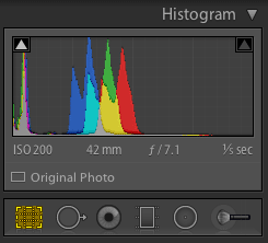
Select a photo to process and then switch to the Develop module. In the Develop module there are some tools on the right side of the window, starting with the Histogram panel at the top. You don't need to use the histogram, but one thing you will find useful in this panel is a list of the camera settings you used to capture the image you're about to develop (ISO, focal length, aperture, and shutter speed). The focal length listed is the actual focal length of the lens you used, not the 35mm-equivalent focal length. Knowing what settings you used for a shot can be helpful when comparing different images or learning how your camera behaves with different settings.
Just below the histogram panel is a row of tool icons. The only one you will be using is the first one, the Crop Overlay tool, highlighted in yellow in this screenshot:
Click the Crop Overlay tool icon and a gridded box will be displayed over your image. You can drag the corners around to remove any part of the image you don't want to be in the final photo (for example, if you took a picture of a painting, you would crop out the painting and remove everything else). If your image needs to be rotated at all — maybe you took the photo at a slight angle by mistake — you can use the Angle slider to straighten it out. When you're done, press the Enter (or Return) key. If you want to use the entire image, skip this step. If you make a mistake, on the left toolbar there is a History panel where you can undo any changes you've made or even revert back to the original imported image without adjustments. This is available even after you close Lightroom.
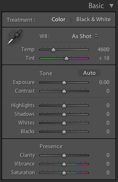
The next panel in the toolbar is the Basic panel. The first set of controls in this panel, labeled WB, is for adjusting white balance. We'll come back to that, but let's move onto the second set of controls: the Tone sliders.
Most of the time, the only slider you will using here is the Exposure slider. Because this is a raw image (not a JPEG), the camera captured significantly more range of values than can be represented in a finished photograph. The Exposure slider uses this extra image data to essentially change your exposure even after you've captured the image with your camera. This is not the same as simply darkening or lightening a JPEG image — it really is just like you took the photo with a different exposure. There are limits to what the slider can handle, however. For example, if the highlights of your captured image were excessively "blown out", the Exposure slider will not have the image data in those areas it needs to decrease the exposure in those areas accurately. This is one reason why it's still important to try to get the best exposure you can when taking the shot with your camera.
So use this slider to make minor adjustments to exposure, and if you have multiple exposures of the same image, start with the image that is exposed as close to correct to begin with. Also note that people have a natural tendency to select the brighter of two exposures when seeing them side by side or switching back and forth between them, even if the brighter exposure is actually a little overexposed (or very overexposed). So when selecting an image to start with, err on the side of choosing an image that is too dark; and when sliding the exposure slider, try sliding it to the left (darker), looking at the dark version of the image for a minute, and then gradually slide the slider to the right (brighter), stopping when the image looks correct.
The next Tone slider in the Basic panel is Contrast. This should be left at 0 to preserve the accuracy of relative values.
The next group of Tone sliders are for making adjustments to specific values within the image. They are the Highlights slider, the Shadows slider, the Whites slider, and the Blacks slider. This is where you can cheat a bit if there are problems with your photo. For instance, if some of your brightest highlights are just barely blowing out, you can try reducing them with the Whites slider or the Highlights slider to see if you can restore any color to them. If you did this, you would need to analyze the entirety of your image (not just brightest highlights you're trying to fix) and make sure you're not causing other parts of the image to look unnatural. If you do make any changes, you can use the History panel on the left side of the screen to switch between the adjusted image and the image before the latest adjustments and compare the two. Be very careful, as it's easy to get carried away here.
Do not use the Auto button in the Tone controls. Also, there is another set of controls below the Tone sliders: the Presence sliders. These should all be left at 0.
Okay, so now let's go back to that White Balance section of the Basic panel that we skipped over. Being able to change the white balance after an image was shot is another thing you can do with raw images that you can't do with JPEGs. Rather than setting the white balance in the camera, it's much easier to adjust it here in Lightroom. There are two sliders here: Temp (Temperature) and Tint. Try moving these sliders left and right to see what they do. If you didn't use a gray card, simply adjust these sliders until the image looks right to you.
If you did use a gray card, this is where we're going to take advantage of it. In Lightroom, switch over to the photo you took of your gray card in the same light as the image you're currently in the middle of processing. Now click the eyedropper icon in the white balance settings section. This is the White Balance Selector tool.
Take the eyedropper and click on your gray card in the image. Be sure to click in an area where the entire color selection is the gray material of the card. When you do this, the white balance sliders will automatically change to match the color of the light you were shooting the photos in. Write the Temp and Tint numbers down or memorize them. Now go back to the image you were originally processing, and change the Temp and Tint to the values you obtained from the gray card. You have now neutralized the color of the light.
If the photograph you're processing is a photo of a painting, then you're done. But as discussed in the White Balance section of this guide, if you're processing a photo of anything else, you may not want to neutralize the light entirely. The color of the light gives flavor to the image. To bring this flavor back, first, take note of your Temp and Tint numbers, jotting them down on a piece of paper if necessary. Then, change the Temp number in Lightroom to 5500 and the Tint number in Lightroom to +10. This is what Lightroom considers "daylight", which we can consider a balanced neutral color of light. Now, gradually move each slider towards the numbers you wrote down (or memorized), and this will slowly bring the light color back to neutral. For example, if the numbers you got from your gray card were 5000 and 0, you would get a perfect compromise between the two by sliding the sliders to 5250 and +5 (because 5250 is the average of 5000 and 5500, and 5 is the average of 0 and 10). I am explaining this with precise numbers for the sake of clarity, but all you need to do is slide the sliders between the daylight numbers and the gray card numbers until you like the way it looks. Alternatively, if you liked the way it looked when set to "daylight" (5500 and +10), just leave it there. This is all there is to adjusting white balance.
And we're almost done with Lightroom! You should generally not change any of the other settings in the Develop module. You'll notice we didn't save the image. That's because Lightroom is a "non-destructive" editing environment, and any adjustments you make are automatically saved with the image, but can be undone using the History panel at any time, even if you close Lightroom and open it again. In other words, your original raw image file is never overwritten.
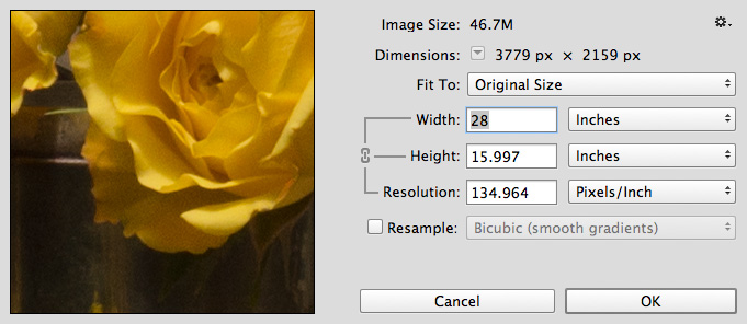
The last thing to do is export the image out of Lightroom so you can open it in Photoshop. Switch back the Library module. Right next to the Import button you used earlier is the Export button. Make sure the image you adjusted is selected and then click the Export button. A window will pop up with lots of settings you can change. You can change the Export Location and File Namingsettings to whatever you see fit. In the Image Sizing settings, make sure Resize to Fit is not checked, and likewise, in the Output Sharpening settings, make sure the Sharpen For checkbox is not checked.
The critical settings here are in the File Settings section. In this section, Image Format should be set to PSD (which stands for Photoshop Document), and Color Space should be set to ProPhoto RGB. When you're done, click Export.
Because you used Lightroom to process your raw image, you can skip the next section. If you're processing an image to share on the web, go to the Saving Photographs for the Web section. If you're processing an image to make prints with, go to the Saving Photographs to Print section.
6.2 – Using Photoshop to Process Raw Images
Connect your camera to your computer and upload all the photographs you've taken with your camera. When you connect your camera to your computer, you may have a default camera-import program that pops up (on Macs, iPhoto is the culprit). If this happens, just close those windows and ignore it for now. Be sure that you upload your photos directly to a folder on your computer or the desktop — do not import them into a program like iPhoto.
Open Photoshop and then go to File > Open and select all of the photos you just uploaded, then click Open. A new window will pop up. This is the Camera Raw window, which automatically comes up any time you open a raw image. All the images you opened are listed on the left side of the window (you may need to scroll down to see them all). Before we start, at the very bottom of this window you should see a small string of blue text, something like this:
Click that and the Workflow Options window will pop up. Make sure all the checkboxes in the Image Sizing, Output Sharpening, and Photoshop panels are not checked. In the Color Space panel, click the Space drop-down menu and select ProPhoto RGB, then click OK.
On the left side of the Camera Raw window is a list of the raw images you opened, if you opened more than one. Select one to process.
On the right side of the Camera Raw window are some tools, starting with a little graph at the top. The graph is called a histogram, but you don't need to use it. Just under the histogram is a useful list of the camera settings you used to capture the selected image (aperture, shutter speed, ISO, and focal length). The focal length listed is the actual focal length of the lens you used, not the 35mm-equivalent focal length. Knowing what settings you used for a shot can be helpful when comparing different images or learning how your camera behaves with different settings.
Just below these camera settings is a row of tabs with little icons. You will only be using the first tab — the Basic tab — which is already open by default. But let's do one thing first: look at the toolbar at the top of the center of the window. The sixth icon in this toolbar is the Crop Tool.
Click the Crop Tool icon and then click and drag over your image to create a box. You can then drag the corners of the box around to remove any part of the image you don't want to be in the final photo (for example, if you took a picture of a painting, you would crop out the painting and remove everything else). If your image needs to be rotated at all — maybe you took the photo at a slight angle by mistake — you can use the Straighten Tool (the icon to the right of the Crop Tool) to straighten it out. When you're done, press the Enter (or Return) key. If you want to use the entire image, skip this step. If you make a mistake, just click the Crop Tool again and press the Escape (ESC) key.
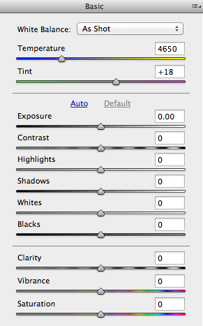
Back to the toolbar on the right side of the screen. These sliders are what you will use to make adjustments to your raw image. Let's skip the first two sliders — Temperature and Tint — and we'll come back to them later. For now, let's focus on the sliders below those two.
Most of the time, the only slider you will using here is the Exposure slider. Because this is a raw image (not a JPEG), the camera captured significantly more range of values than can be represented in a finished photograph. The Exposure slider uses this extra image data to essentially change your exposure even after you've captured the image with your camera. This is not the same as simply darkening or lightening a JPEG image — it really is just like you took the photo with a different exposure. There are limits to what the slider can handle, however. For example, if the highlights of your captured image were excessively "blown out", the Exposure slider will not have the image data in those areas it needs to decrease the exposure in those areas accurately. This is one reason why it's still important to try to get the best exposure you can when taking the shot with your camera.
So use this slider to make minor adjustments to exposure, and if you have multiple exposures of the same image, start with the image that is exposed as close to correct to begin with. Also note that people have a natural tendency to select the brighter of two exposures when seeing them side by side or switching back and forth between them, even if the brighter exposure is actually a little overexposed (or very overexposed). So when selecting an image to start with, err on the side of choosing an image that is too dark; and when sliding the exposure slider, try sliding it to the left (darker), looking at the dark version of the image for a minute, and then gradually slide the slider to the right (brighter), stopping when the image looks correct.
The next slider is Contrast. This should be left at 0 to preserve the accuracy of relative values.
The next four sliders are for making adjustments to specific values within the image. They are the Highlights slider, the Shadows slider, the Whites slider, and the Blacks slider. This is where you can cheat a bit if there are problems with your photo. For instance, if some of your brightest highlights are just barely blowing out, you can try reducing them with the Whites slider or the Highlights slider to see if you can restore any color to them. If you did this, you would need to analyze the entirety of your image (not just brightest highlights you're trying to fix) and make sure you're not causing other parts of the image to look unnatural. Be very careful, as it's easy to get carried away here.
Do not use the Auto button above the Exposure slider. Also, there are three more sliders below the Blacks slider: Clarity, Vibrance, and Saturation. These should all be left at 0.
Okay, so now let's go back to the first two sliders we skipped over earlier, the Temperature slider and the Tint slider. These allow you adjust the white balance. Being able to change the white balance after an image was shot is another thing you can do with raw images that you can't do with JPEGs. Rather than setting the white balance in the camera, it's much easier to adjust it here in Photoshop. Try moving these sliders left and right to see what they do. If you didn't use a gray card, simply adjust these sliders until the image looks right to you.
If you did use a gray card, this is where we're going to take advantage of it. On the left side of the window where all the raw images you opened are listed, select the photo you took of your gray card in the same light as the image you're currently in the middle of processing. In the toolbar at the top of the window, the third button has a little eyedropper icon. This is the White Balance Tool.
Selection the White Balance Tool and drag a small box over your gray card in the image. Be sure to make the box such that the entire box is filled with only the gray material of the card (no background from around the card). When you do this, the white balance sliders will automatically change to match the color of the light you were shooting the photos in. Write the Temperature and Tint numbers down or memorize them. Now go back to the image you were originally processing (by selecting the image in the list on the left side of the window), and change the Temperature and Tint to the values you obtained from the gray card. You have now neutralized the color of the light.
If the photograph you're processing is a photo of a painting, then you're done. But as discussed in the White Balance section of this guide, if you're processing a photo of anything else, you may not want to neutralize the light entirely. The color of the light gives flavor to the image. To bring this flavor back, first, take note of your Temperature and Tint numbers, jotting them down on a piece of paper if necessary. Then, change the Temperature number in Photoshop to 5500 and the Tint number in Photoshop to +10. This is what Photoshop considers "daylight", which we can consider a balanced neutral color of light. Now, gradually move each slider towards the numbers you wrote down (or memorized), and this will slowly bring the light color back to neutral. For example, if the numbers you got from your gray card were 5000 and 0, you would get a perfect compromise between the two by sliding the sliders to 5250 and +5 (because 5250 is the average of 5000 and 5500, and 5 is the average of 0 and 10). I am explaining this with precise numbers for the sake of clarity, but all you need to do is slide the sliders between the daylight numbers and the gray card numbers until you like the way it looks. Alternatively, if you liked the way it looked when set to "daylight" (5500 and +10), just leave it there. This is all there is to adjusting white balance.
The last thing to do is to save a copy of the image as a Photoshop document. To do this, click Open Image in the bottom-right corner of the Camera Raw window. This will open the image in the main Photoshop interface. If you select multiple images from your list of images in the Camera Raw window and then click the Open Image button, you can open multiple files at once. To save an image as a Photoshop document, go to File > Save as. This will bring up the Save As window. Choose a name for your Photoshop document in the text field at the top, and choose where you want to save the Photoshop document. Be sure to click the Format drop-down menu and select Photoshop. Make sure the checkbox next to Embed Color Profile: ProPhoto RGB is checked, and then click the Save button. Your PSD (Photoshop Document) file is now saved.
If you're processing an image to share on the web, continue to the next section. If you're processing an image to make prints with, go to the Saving Photographs to Print section.
6.3 – Saving Photographs for the Web
PSDs (Photoshop Documents) are very large file sizes. This means it takes a long time to upload and download over the Internet, requires Photoshop to open, and takes up a significant amount of space on hard drives. In addition to this, your PSD dimensions will generally be far too big to view conveniently, much bigger than most computer monitors. When saving photographs for the web — this means any photos you want to email or put on a website — you need to deal with these issues, and it's very quick and easy to do.
Open the PSD you saved and then go to File > Save for Web (or in the newest version of Photoshop, File > Export > Save for Web). The Save for Web window will pop up with a preview of your image. On the right side of the window are all the settings you will be modifying.
The very first thing to do is adjust the settings in the Image Size section. You can either choose an explicit width (W) or height (H) in pixels, or change the Percent number. For example, if you choose 50%, your image will be be resized to half of it's original pixel dimensions. For most photographs, the Quality drop-down menu should be set to Bicubic.
In the bottom-left corner of the window there is a small field with a percentage in it (100% by default). This is how zoomed into (or out of) the image your preview is. When adjusting the size of the image with the Image Size settings, be sure this percentage in the bottom-left corner of the window is set to 100% so you can see the actual size.
Now that you've solved the problem with the pixel dimensions, you just need to adjust the file size. In the top-right corner of the window, there is a drop-down menu just below the Preset label. Use this to select JPEG, as this is the best format for compressing photographs. I recommend not checking the Progressive checkbox, but do check the Optimized checkbox.
There are two other checkboxes which are extremely important. First, do not check the Embed Color Profile checkbox. Second, make sure to check the Convert to sRGB checkbox.
Now you just need to decrease the file size of the image by compressing it. The Quality value in the top-right of the Save for Web window lets you adjust how much the image is compressed. The simple way to do this if you're not too particular is to simply click the drop-down menu to the left of Quality and select Very High. Feel free to do this and then click the Save button to save a JPEG version of your photo to use on the web.
For those interested in being more precise about this, let's start with a quick explanation of what we're doing. JPEG is a "lossy" format. This means when you save something as a JPEG, the image data is compressed and some of it is lost. If you were to save a JPEG, and then open it and resave it as a JPEG, and you repeated that process many many times, eventually so much image data would be lost that you wouldn't even be able to tell what the image was in the first place. However, lossy formats are useful because the compression can make the file size much smaller without changing the way the image looks at all, so long as you do it correctly. Saving a JPEG over and over again is an example of how not to do it! Always start with a PSD and don't reprocesses JPEGs you've saved if you can avoid it.
To see what a very overcompressed image looks like, try setting the Quality value to 0 (the minimum quality) and press the Enter (or Return) key. Then raise the value to 100 (the maximum quality), and look at the image before pressing the Enter (or Return) key again. Be sure the preview is zoomed to 100% (used the drop-down menu in the bottom-left corner of the window) as this is how the image will be viewed on the web.Ideally, you want to use the lowest value that still looks identical to a setting of 100.
Here's an easy way to do this. In the top-left corner of the Save for Web window are four tabs: Original, Optimized, 2-Up, and 4-Up. Clicking the Original tab will show you what the original image looked like, and clicking the Optimized tab will show you what the image looks like with the current compression setting. If you notice a color shift when you click the Original tab, don't worry — just go over to the Preview drop-down menu on the right side of the window and select Document Profile. Anyway, now you can switch back and forth between Original and Optimized while adjusting the Quality value, and if there are any differences between the two, they will be easier to spot.
A few things to note here. First, for most situations, it is not critical that your file size be as tiny as possible. The difference between a value of, say, 50 and 55, is generally not that big. So for most situations, err on the side of higher quality. If you can't see any differences between the Original and Optimized images at a value of 70, why not bump it up to 80 just in case? The file sizes will still be significantly smaller than they would be if you did not "save for web" at all. You can see what the exact file size will be at a given Quality value by looking in the bottom-left corner of the window, just under the preview image.
Second, if you're planning to upload your photo to Facebook or other services like some blogging software, that automatically compresses images you upload, you do not want to upload an image that is already as compressed as it should be. What will happen is, the compressed image will be compressed again, and this can reduce to the quality significantly. So for these cases, set the Quality to 100, or, if that's too big to upload, try 95 or 90.
Lastly, if you have a website and host your photos directly, this is the one situation where it can be important to compress the image as much as possible (decrease the Quality value) without reducing the perceivable image quality.
When you're done, click the Save button. If you need to go back and make any adjustments to your image, do not open the JPEG you saved for the web and edit that. That's already been compressed and should not be edited or resaved ever again. Instead, open your PSD and start from there.
6.4 – Saving Photographs to Print
The actual printing process is covered in the Making Prints section, but first you will need to scale your image to the correct size. You will also need to crop out individual prints if your photo will not fit on a single sheet of photo paper.
Click here for an older video Mark made walking you through it, step by step. This was an older version of Photoshop (because it was filmed a long time ago), but the same procedure applies with the latest version of Photoshop. You will be using the PSD you saved earlier, so you might want to make a copy of that file just in case you mess something up and save it by mistake!
A few important notes about the video:
When using the Ruler tool, make sure the User Measurement Scale checkbox at the top of the Photoshop window is unchecked.
When Mark changes the Document Size, the interface is different than it is in the latest version of Photoshop. The new image size interface looks like this:
It is extremely important that you don't change the pixel dimensions. All you're doing when you follow Mark's instructions is changing the size the image will be printed at, without modifying the actual image. To do this, make absolutely sure to uncheck the Resample checkbox. This is absolutely critical.
Where Mark says to find something on your photo to measure — for example, he measures from the outside edge of Emily's earrings — there is a simpler way to do this. Simply make a line with the digital ruler and then measure that with your physical ruler. You don't need to measure between any two particular points in the image, you can just use the arbitrary distance of the digital ruler line you make. You should make the digital ruler extend across most of your screen when you do this (to increase error tolerance).
When you get to the part where you create a new document for a particular print (in the example, Mark makes 8×10 documents), make sure to save each of these separately so if you need to print more copies later you can. When you save, use File > Save As and be sure to save them as Photoshop Documents (PSDs).
One last note: while some printers have a "borderless" printing mode, they often don't work very well, so take into account a border of typically a quarter of an inch or even a little more when printing. For example, if you're using 13×19 inch photo paper, when you copy print-sized sections of your image, don't select a 13×19 inch area, select a 12.5×18.5 inch area instead.
When you're finished, you can skip ahead to the Making Prints section. If you're painting a full-length portrait, however, continue to the next section first.
6.5 – Foreshortening in Portraits
In the case of a full-length portrait, if you're camera was level with the subject's eyes (as it should have been), and you were at around fifteen feet or further from the subject (as you should have been), the face and upper body will look correct when scaled to full size. However, the lower body — so generally speaking, from the waist down — was significantly lower than the camera, meaning that the perspective of the legs in the photograph is from an angle. In person, we don't see people's feet from directly in front — instead, since our head is well above the ground, we look down at feet.
But consider this: if you painted a life-sized, full-length portrait from the photo, anyone who views the painting in typical conditions is going to see the lower parts of the painting — the part with the legs — from that same "looking down" perspective. The shortening aspect of perspective is being applied twice, and as a result, the legs will look too short. This is called "foreshortening", and artists have been correcting for this problem since the Italian Renaissance.
Some elaboration on how to fix this problem will probably be added to this guide at a later date, but in short, you can use Photoshop to adjust the subject from the waist down to the feet to counteract this foreshortening effect. If this is something you will be dealing with for an upcoming painting, consider starting a discussion about it in the Draw Mix Paint Forum.
Another thing to be mindful of is if part of the subject's body is significantly closer to the camera than the rest of their body — for example, if their arm is stretched out towards the camera — the body part close to the camera will appear far too large in the final portrait. This does not mean that you can't paint people in these poses, but you might need to make some adjustments to the relative sizes of these seemingly out-of-proportion areas.
You will need a color printer designed to print on glossy photo paper. Results will vary from printer to printer. A very good printer is recommended in the Buying Guide section.
7.2 – Printer Settings
These printer settings are for Epson printers, but if you have a different brand, these settings may still apply or be similar to the options for your printer.
In Photoshop, go to the File > Print and the Print Settings window will open. In the top-right corner of the window (Printer Setup), select your printer from the Printer drop-down menu, then click the Print Settings button. Another menu will open where you will need to select the correct Paper Size for the paper you're using, as well as the Media Type (type of paper). For example, if you're using 13×19in Premium Photo Paper Glossy, then you need to set the paper size to the Super A3/B 13×19in preset, and you need to set the media type to Premium Photo Paper Glossy. Then click Save.
In the main Print Settings window, in the top-right section (Printer Setup) set Copies to 1. For Layout, select the orientation appropriate for your print.
Below that section is the Color Management section. Set Color Handling to Photoshop Manages Colors and set the Printer Profile to the correct printer/paper combination. For example, if you're using the Epson Stylus Photo R3000 with Premium Photo Paper Glossy paper, you would select SPR3000 Epson Premium Glossy. In the options below this, be sure the Rendering Intent is set to Relative Colorimetric and the Black Point Compensation checkbox is checked.
Further down the menu is the Position and Size section. If you're printing full-scale prints, make sure Scale is set to 100% and the Scale to Fit Media checkbox is not checked.
Make sure your printer is on and connected to your computer, then click Print.
7.3 – Print Adjustments
The way your photos look on your computer monitor will most likely be different than the way they look in a print. To deal with this, open the Photoshop file of your source photo and make a print. Follow the instructions in the previous section carefully when you do this, then cut off any white paper bordering the photo in the print.
Do not judge your photo until you take it under your balanced white studio lights with the white paper border removed. Look for anything that doesn't look like you expected it to — maybe you need to use a darker or brighter exposure, maybe you need to tweak just the shadow values, maybe you need to tweak the highlights, etc.
Whatever the problem is, figure out what you need to change to fix the problem, and then go fix it, even if that means going back to the raw image or selecting a differently exposed image to begin with. At this point, you're adjusting for the print output, so don't worry about how the image looks on your screen. Remember to always make these adjustments in a duplicate of your image file, as you will want to save the version that looked correct on your computer monitor separately, just in case you ever need it.
Once you think you may have fixed the issues you found, make another print, cut the white border off, take the print into your studio, and analyze the print again. Repeat this process as necessary until you're happy with a print, then be sure to save a copy of the final print-corrected version. You will be using this version of the image to make your full-scale prints, as explained in the Saving Photographs to Print section.
7.4 – Laminating Prints
If you're going to be checking paint colors from prints, you will need to have the prints laminated. If you laminate lots of prints often, you might want to consider purchasing a laminating machine like the one recommended in the Buying Guide section.
Alternatively, you can take your prints to a shop and have them laminate the prints for you, or you can purchase individual sheets of laminate to apply to your prints manually. Just make sure that the laminate is perfectly clear. To do this, make two copies of a print, preferably a print with some black in it. Laminate one and leave the other unlaminated, then compare the two. They should look exactly the same. If they do not, you need to use a different laminate.
After lamination, cut off any white paper bordering the prints.
8 – Buying Guide
There are lots of good options when it comes to cameras and some of the other equipment, but for people who want a shopping list, here are some recommendations. If you're not a beginner, consider selecting your own equipment, as everyone's needs and budgets are different.
8.1 – Camera & Lens
If you don't know where to start when shopping for cameras, consider the Olympus OM-D E-M10, because it's well designed, easy to use, and priced very competitively.
It is a "Micro Four Thirds" camera, which means the sensor is smaller than a full-frame sensor. This means your image resolution will be lower than a full-frame camera's, but still much higher than with a compact point-&-shoot camera, and it means the crop factor (see the Focal Length section) for your lenses will be 2. Thus, a 25mm lens on this camera would be the 35mm-equivalent of 50mm lens (the numbers simply double). Lenses with longer focal lengths tend to be more expensive, so your lens selection will generally be cheaper than it would be with a full-frame camera, since you're always "getting double". Just be sure to buy lenses that are designed to fit Micro Four Thirds cameras. Olympus lenses are considered to be very good.
You can usually buy the camera with a "kit" lens (a relatively cheap lens included with the camera for a good price) or without a lens (if you don't want the kit lens and would prefer to buy other lenses). The kit lens with this camera is a 14–42mm lens, which will have a 35mm-equivalent focal length range of 28–84mm. This will not be adequate for full-length portrait photography if you intend to paint life-sized (for that you will likely need to purchase an additional lens), but it's a good all-around lens for pretty much everything else and won't cost you much.
8.3 – Tripod & Monopod
For a cheap lightweight tripod for travelling, the AmazonBasics 62-Inch Aluminum Ball Head Tripod is a great choice at USD$40.
For a heavier, sturdier, but still relatively cheap tripod, the AmazonBasics 70-Inch Pistol Grip Tripod is also a good choice at USD$65. Just bear in mind that it is over twice as heavy as the 62-Inch model. Weight is good in a tripod, but it does make it less travel-friendly. The added height of the 70-Inch model is useful for taller photographers and also for taking photos of taller subjects, in the case of portrait photography.
If you want a monopod, the AmazonBasics 67-Inch Monopod is good and only costs USD$15.
8.4 – Gray Card
The WhiBal G7 Certified Neutral White Balance Card comes in a variety of sizes. The Pocket Card size is the same size as a credit card and costs USD$20.
8.5 – Printer
Printer manufacturers make a lot of their money selling ink refills. Cheaper printers are much more expensive to refill and need to be refilled more often, so if you make a lot of prints, you actually save money by buying a better printer with a higher price tag.
I recommend either the Epson Stylus Photo R3000 or its successor, the Epson SureColor P600, which cost around USD$750 and USD$850, respectively. They print on photo paper as large as 13×19 inches.
If you have a bigger budget and want to be able to print on even larger sheets of photo paper, the Epson Stylus Pro 3880 or its successor, the Epson SureColor P800, are essentially the same as the R3000 or P600 except that they can print on paper as large as 17×22 inches. They are considerably more expensive and would be overkill for most people, and it may be more difficult or cost more to laminate such large prints without cutting them down to a smaller width.
Always use Epson Premium Photo Paper Glossy and read the Printer Settings section before printing. Epson also sells an "Ultra Premium" version of this paper but it is more expensive and unnecessary. The Premium Photo Paper Glossy sheets are available in a variety of sizes including 13×19 inches (the maximum for the R3000 and P600 printers) and 17×22 inches (the maximum for the 3880 and P800 printer).
8.6 – Laminator
If you laminate lots of prints often and don't mind dealing with another piece of hardware, the GBC Ultima 35 EZload Thermal Roll Laminator works well and can laminate prints up to 12 inches wide. It costs about USD$430. When you buy rolls of laminate for the laminator, be sure to get the 1.7mil sheets (the thinnest available).
8.7 – Lightroom & Photoshop
Adobe is currently offering both the latest versions of Lightroom and Photoshop together for USD$120/year, available here: creative.adobe.com/plans/photography
Before you purchase, though, you can get a free month by taking advantage of the 30-day trial for both products offered at the bottom of the that page. This will also allow you to make sure your computer is adequate for running these programs.