Before we begin, are you working from life or from a photo?
Choosing Items to Paint
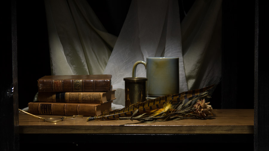
Before you can determine what size canvas to use, you must set up your still life and decide what to paint. There should be at least three objects in your still life so that you can get the most out of this course and my teaching.
For this course, I recommend not painting anything that is perishable. You will be going very slow in this course, so you do not want to paint flowers that will wilt or fruit that will change color over time. You can paint things like that after you've become comfortable with the method.
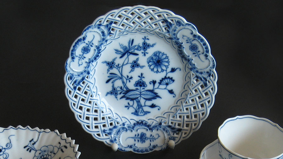
In addition to perishable items, stay away from strong, perfect patterns when choosing subjects for this course — especially patterns that have bright and dark areas in the pattern together. Here are some examples of patterns you should avoid.
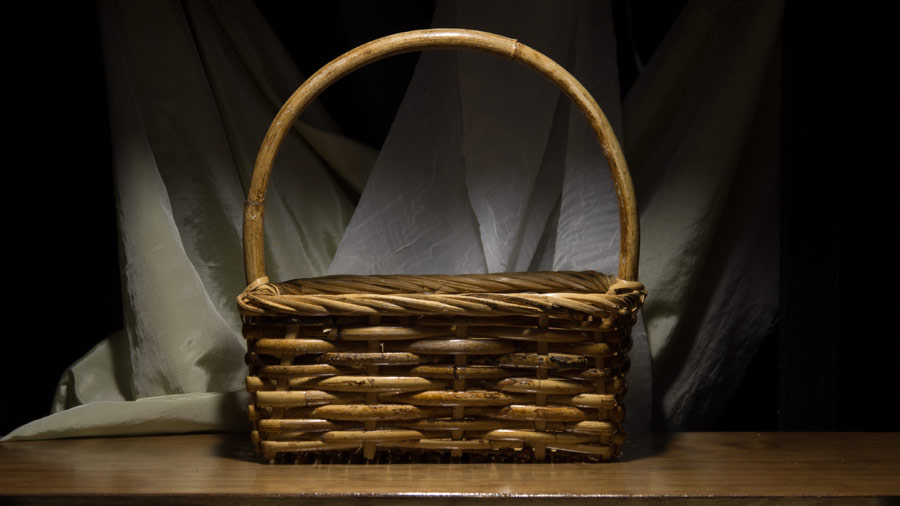
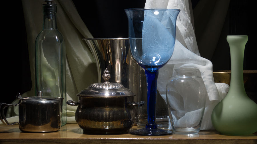
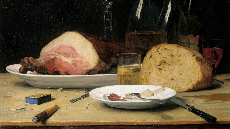
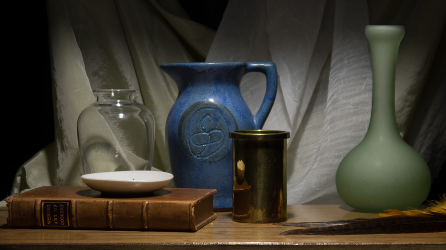
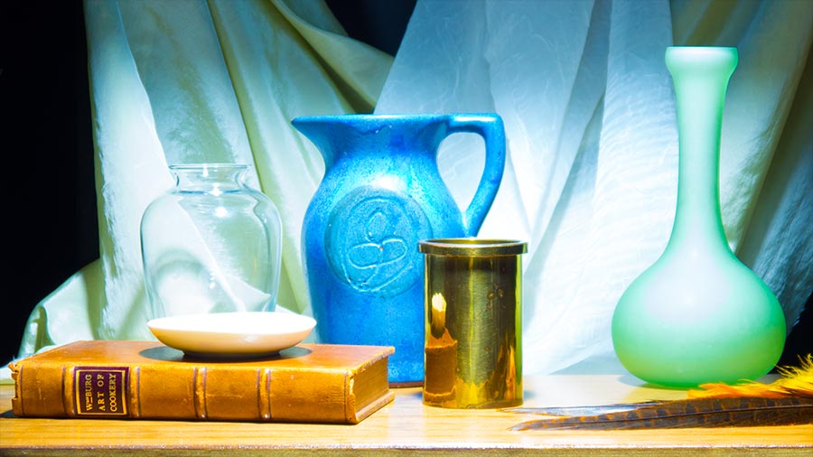
On the other hand, there are many items that I see students avoid because they think the items would be too difficult to paint. In fact, things like glass, brass, transparent fabrics, and many other items that seem like they would be difficult to paint are actually very straightforward. Here are some examples of objects that would be relatively easy to paint.
Building a Shadow Box
If you set a still life up under your studio lights, you will be very limited in how you light your still life. Studio light is typically "washed out" and uninteresting. I recommend building a shadow box so you can completely control the light on your still life.
You don't have to make your shadow box out of wood, but watch this video before deciding how to make one for yourself. It's actually very easy to make.
Toward the end the video, I explain something which is critical! At the 17:20 mark I explain how to make sure you will not get glare on your color checker while checking your colors. No matter how you build your shadow box, be sure you to carefully do the glare test I demonstrated in the video.
Setting Up Your Still Life
Take the time to set up a nice still life that you really like — don't settle for something mediocre. If it takes you a few days and 25 attempts to settle on something you're happy with, it will be worth it! Watch this video where I give lots of advice on setting up a still life.
Balancing Your Still-Life Light with Your Studio Light
Before you can check colors accurately, it is extremely important that your still-life light is neither too dim nor too bright compared to your studio light. You can easily test this by putting white paint on your color checker and then comparing it to some white paint in your still life.
Watch this video to see exactly how to do it properly. The specific part you need to watch begins at the 2:00 mark.
All the careful checking and double-checking you're doing now will not only make painting easier for you, it can significantly improve your final work!
next step →A Note About Working from a Photograph
If you work from your own photograph, it's important that you work from a good photograph. It is always preferable to work from life as it does not require that you take a good photo, process it correctly, and make a quality print from it. Life always has perfect color. When taking photographs and making prints, you must know what you are doing or the colors and values will be completely wrong. On this page I will provide as much information as possible to help you photograph, process, print, and laminate a good photo of your subject to paint from, but for many people this is very difficult — and in some cases, it can be expensive.
Choosing Items to Paint
Before you can determine what size canvas to use, you must set up your still life and decide what to paint. There should be at least three objects in your still life so that you can get the most out of this course and my teaching.
Stay away from strong, perfect patterns when choosing subjects for this course — especially patterns that have bright and dark areas in the pattern together. Here are some examples of patterns you should avoid.
On the other hand, there are many items that I see students avoid because they think the items would be too difficult to paint. In fact, things like glass, brass, transparent fabrics, and many other items that seem like they would be difficult to paint are actually very straightforward. Here are some examples of objects that would be relatively easy to paint.
Setting Up Your Still Life
Take the time to set up a nice still life that you really like — don't settle for something mediocre. If it takes you a few days and 25 attempts to settle on something you're happy with, it will be worth it! Watch this video where I give lots of advice on setting up a still life.
Because you will be working from a photograph instead of working from life, you don't need to build a shadow box like in the video. You can set up a still life on your kitchen counter or wherever you like the light. I would recommend using natural window-light instead of artificial lights. Move your still-life table around your home or studio and explore how the natural light changes. You could even set a table by a window, in a doorway, or an open garage. Or just go out and find your still life already set up — in your pantry, in an antique store window, on your dresser, etc.
A kitchen counter or dining room table is a great place to set up a still life if the light is good. Be sure to make note of how the light changes throughout the day.
The Importance of Working from a Quality Photo
You are not required to use a quality photograph to paint from for this course, but do consider the following before deciding what photo you will use.
Ideally an artist wants their source photograph to look like the real thing. That means that the colors and values should be the same in your photo as they are in real life. Unfortunately this is almost never the case. Except for very rare exceptions, all photos taken with modern cameras set to automatic are overexposed and oversaturated.
The degree to which this is true is easier to demonstrate than it is to explain with words. In the photo below I have taken great care in how I photographed the subject, how I processed the image (with Photoshop), and how I printed the image so that the colors and values in the final print closely match those you would see in life.
That's how it should look. However, if you use the automatic mode on your camera, as I did in the photo below…
As you can see it is very different. So if possible, at the very least, use a photo that is exposed properly. It's also easier to work from a properly exposed photo because it tends to have fewer value steps. Working with the bright whites in an overexposed photo is also more difficult.
If Possible, Do Not Work from Small Photos
Although not required for the course, the photo you work from should be enlarged so that objects in the photograph are the same size as they will be when you paint them. That means if you're going to paint a vase four inches wide, the vase in your photo should be four inches wide as well.
This is very helpful and makes it much easier to draw and paint accurately — although it does mean you will likely be working from multiple prints (if your painting is larger than the size of one print).
Using Your Camera and Making Prints
As you try different setups, be sure to take many, many photos, and then afterwards go through them all and choose your favorite one to paint.
Click here for a simplified guide on how to take photographs to paint from.
If you are an experienced photographer or if you want to get the best possible results, then I highly recommend using our Advanced Photography Guide instead.
Using Glossy Photo Paper and Laminating Prints
Always use glossy photo paper, never satin or matte. Glossy photos have darker blacks than photos with a satin or matte finish.
Because you will be checking your paint colors directly on the photo, you will also need to laminate your print. Be sure to use a crystal clear laminate. Whatever you use or wherever you go to have your photos laminated, do a quick test first: take two copies of a photo and only laminate one of them. Check that the blacks in the photo remain black and do not become "milky". The laminated photo should be indistinguishable from the photo that has not been laminated.
Use a Good Photograph Holder
It is essential that the photo you work from be positioned right next to your canvas. You should not be looking up or down at your photo, nor should you be having to turn your head more than necessary.
Here is a video where I demonstrate a super easy one you could make yourself, or you can have someone make it for you. The cost of materials is very small.
next step →