Before we begin, are you working from life or from a photo?
How to Mix Colors
Before we begin, watch Part 2 of "How to Paint Realism" below. If you do not have the video, you can either purchase it by clicking the video below, or you can watch my free YouTube video "How to Mix Colors" by clicking here. The free video covers the entire process of color mixing, it just does not demonstrate beyond mixing colors for a single silver cup.
After you watch the Part 2 of "How to Paint Realism", read the entire page below at least once before beginning to mix your colors.
Two Important Definitions
There are only two properties of colors that you need to know in order to mix colors well. They are value and tone.
VALUE is the darkness or lightness/brightness of a color. The three colors below are all the same value, even though one is a reddish color, one is a yellowish color, and one is a blueish color.
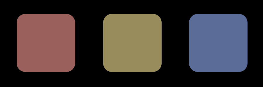
Value is not how blue or red or yellow your color is, it is simply how dark or light your color is.
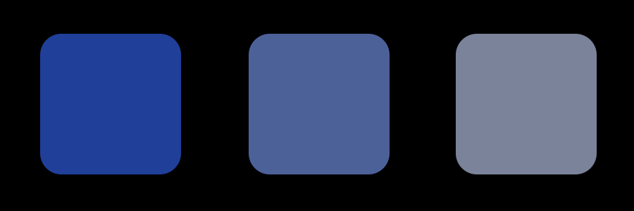
TONE is a word that can mean different things, but in this course it simply means the "color" of the paint, not the value. The two blue colors below are both the same tone, even though they they are different values (one is a darker value and one is a lighter value).

Tone doesn't just mean "blue, purple, red, orange, yellow, or green", but also how intense the color is. For example, the three blue colors below all have a different tone — the first is very blue, the second is less blue, and the third is only a tiny bit blue.
So value refers to the darkness or lightness of a color, while tone refers to how blue, purple, red, orange, yellow, or green the color is. It's as simple as that.
Color Names vs Pigment Names
- when I say add "red" I mean add pyrrole rubine (or alizarin crimson)
- when I say add "yellow" I mean add cadmium yellow
- when I say add "blue" I mean add French ultramarine
- when I say add "brown" I mean add burnt umber
- when I say add "white" I mean add titanium white
If you happen to be using colors other than those that I recommend on the supply list, this may or may not work for you.
Using Two Palettes
I like to use two glass palettes when I paint. I also like to paint the bottom of my palettes the same color that I stain my canvases, although this is not essential. Here is a video which explains how I paint mine:
And here is a video on how to make a great palette table to hold your palettes:
Even if your palettes are different than mine, you will need two clean palettes — one will be used for mixing, and you will transfer the finished colors you mix to the second one.
Mixing Black Paint
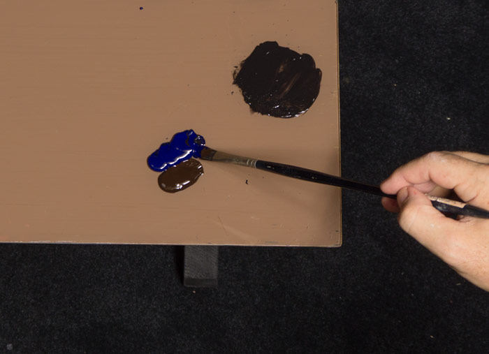
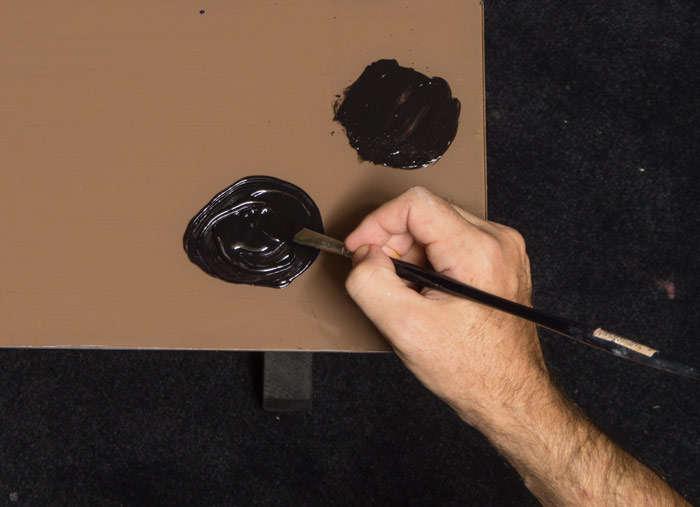
Because most color groups have black in them, you will very likely need black paint throughout your still life. So it is best to go ahead and mix about three tablespoons of black paint to have ready to use. To make black paint, mix roughly 60% blue and 40% brown together on your mixing palette.
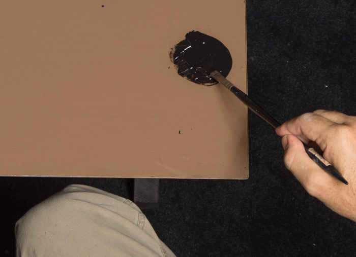
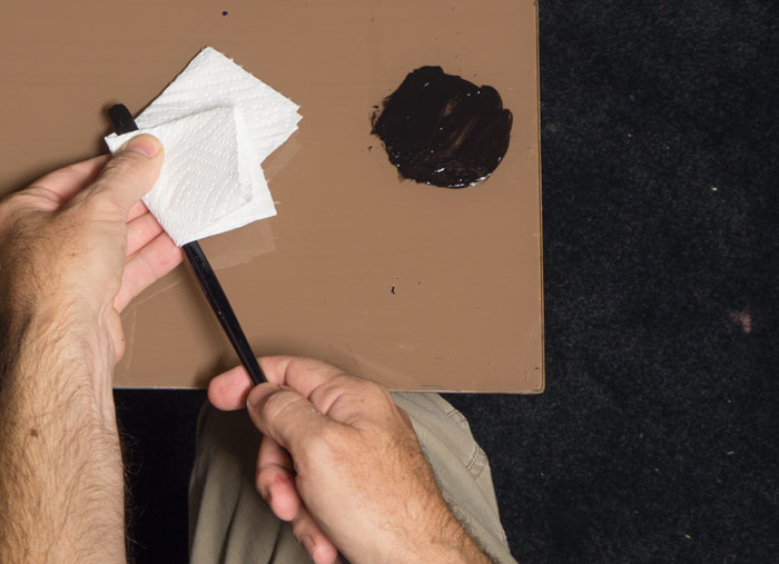
Important: Whenever you mix black paint, or paint with black paint, it is critically important to use a brush that only has black in it (a mixture of blue and brown). So before attempting to mix some black paint you must first "clean" your brush thoroughly. The fastest and easiest way to clean a brush for black paint (pictured below) is to clean it with a small amount of black paint. Work your dirty brush into a small amount of black paint, then wipe the paint out of the brush with a paper towel before mixing the brush into a bit more fresh black paint. Repeat this a couple times (once may be enough) until you get a deep clean black that is not the slightest bit milky.
It's a good habit to keep a brush or two (one large, one small) that you will only use for black paint and nothing else. That way you don't have to clean your brush with black paint again.
Once you mix about three tablespoons of black paint, transfer the black paint you mixed from your mixing palette to your "finished colors" palette. Also paint a stripe of black paint on your mixing palette. You will use this later to help judge your steps (more on that later).
Choosing a Color Group
Before you start mixing colors you need to choose a "color group" to mix. Watch this video to learn more about color groups and how to choose them.
Make Sure You Have Balanced Your Lights
At the end of Step 2: "Choosing Your Subject" there is a section titled "Balancing Your Still-Life Light with Your Studio Light". It is absolutely critical that your lights are balanced correctly before you begin to check colors, so if necessary, please review the video in that section before continuing.
Beginning to Mix Colors in a Color Group
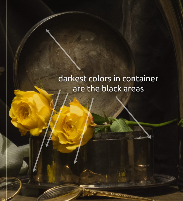
Once you have decided which color group to start with, you need to determine the darkest value in that color group. You will begin by mixing this darkest color, unless the darkest color is black, in which case you have should have already mixed it. Then paint a strip of this on your mixing palette somewhere.
Review the "Mixing Colors" video at the top of this page if you do not know how to begin mixing colors.
Note: If you are have any trouble at all with your color mixing, ask for help on the Draw Mix Paint Forum. Someone will be happy to help!
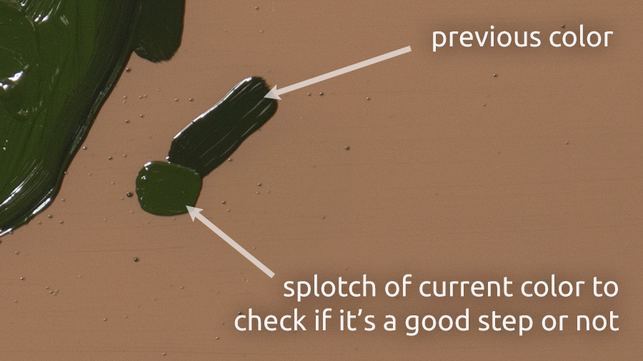
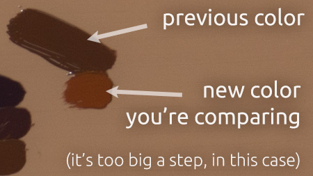
After you have mixed the darkest color in the color group, mix a color that is one step lighter in value than the darkest color. You will determine if your color is a good step by comparing it to the strip of paint you painted on your mixing palette (when you finished mixing your darkest step).
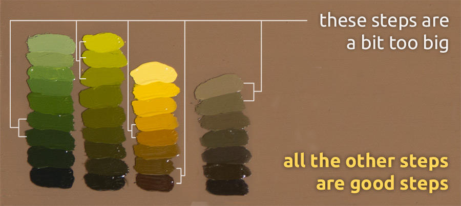
What is a good step? Below are some of the colors I mixed for my still life — I did not mix perfect steps and you don't need to mix perfect steps either. It is not critical that your steps are perfect, but do try to avoid making them too big or too small (this will make things easier for you later on when you begin to paint). Make note of what a good step looks like below.
Remember, you will always mix all the steps in every color group. Do not skip steps, even if you think a particular step is not in the color group — it is almost always there, though you may have to look really hard to find it. If you really explore by color checking throughout the color group, you will generally find every step.
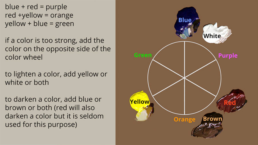
Color Mixing Wheel
Below is a color wheel that will be helpful. Use it as a reference while you mix colors.
Gray and Brown
If you think a color looks too "gray", that means it is too blue. If you think a color looks too "brown", that means it is too red or too orangey-red. Remember this when you are checking your colors. Often you will look at a color and see that your color is too gray or too brown… simply remember that "too gray" means "too blue", and "too brown" means "too red".
How to Mix a Single Color
If you ever get stuck mixing colors, refer to the steps below and follow them to the letter:
- Mix a color on your mixing palette, making sure that it is at least a tablespoon or more of paint. Attempt to mix the color as best you can, but don't worry if you are unsure of what to mix — you will get there.
-
Once you have mixed a color, compare the color you have mixed with the stripe you painted of the previous color (the darker step before the one you are currently mixing). Ask yourself, "is this a good step?", and if the answer is no then darken your color or lighten it so that the step is about right. If the answer is yes, continue.
-
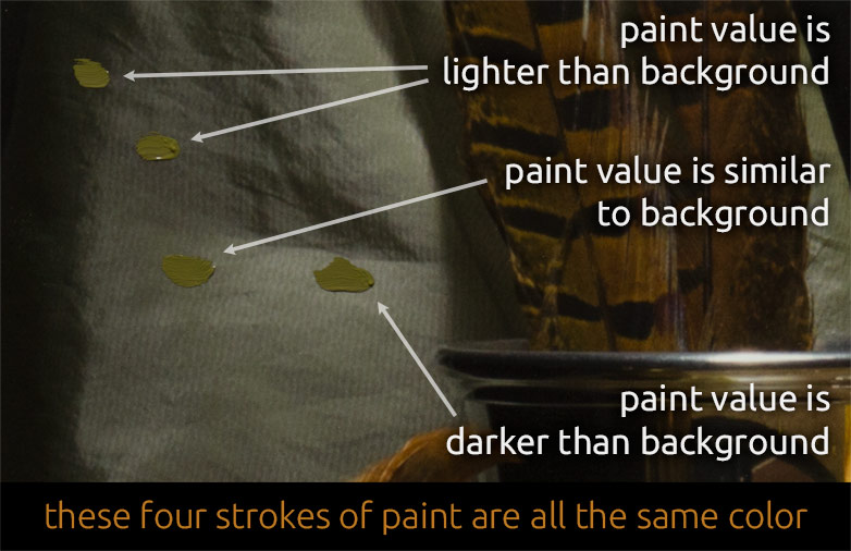
If the color you mixed is a good step, then check the color's tone. Do this by painting the color on your color checker and then comparing it to the color in the still life you are mixing the color for. Be very sure to hold your color checker where the value matches. This is very important — there is no point even looking at the color unless it is being compared to that spot where the value of the paint on your color checker is the same as the value of the color in your object. Once you are sure the value matches, then and only then do you judge the tone.
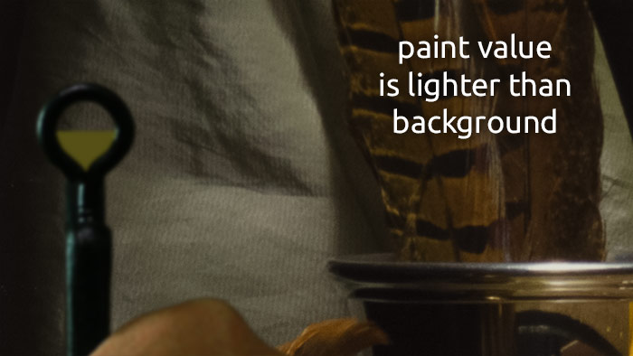
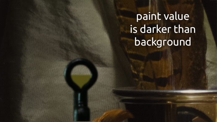
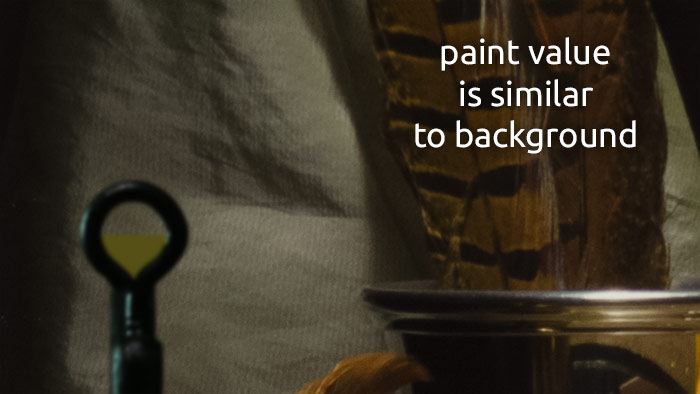
Now ask yourself the six questions below. If you can not answer one question, go to the next until you can answer the question. You may need to ask yourself all six questions. The six questions are:- Which color is more red, the color on the color checker or the object?
- Which color is more orange?
- Which color is more yellow?
- Which color is more green?
- Which color is more blue?
- Which color is more purple?
- Make the adjustment to your color pile by adding the appropriate color. If your color needs to be more red, add red. On the other hand, if your color is too red, add the color on the opposite side of the color wheel (the opposite of red, for example, is green). Use your color wheel to guide you.
- Once you have adjusted your color be very sure to re-check your step. Sometimes when you add color to adjust the tone, you will also inadvertently alter the value as well, so you will need to re-check your step by comparing it to your last color stripe. If the value needs adjusting then you will need to lighten it or darken it until your step is a good step. Once you have confirmed that it is a good step, then and only then re-check the tone with your color checker and ask yourself the six questions.
Repeat this process until you get a good color match. You are now ready to mix the next step in your color group.
Note: When you are mixing the darker colors, use burnt umber as your red instead of pyrrole rubine or permanent alizarin crimson. It is more opaque and easier to work with, and the colors you mix with burnt umber will blend better with other colors when you paint. Burnt umber is also much less expensive. Obviously there will be times when you must use pyrrole rubine or permanent alizarin crimson, especially when mixing strong reds (like red roses or red lipstick). Purples will also need pyrrole rubine or permanent alizarin crimson.
Another Helpful Video on Color Mixing
In this video demonstration I lay out the very basic rules for matching one color to another:
next step →
How to Mix Colors
Before we begin, watch Part 2 of "How to Paint Realism" below. If you do not have the video, you can either purchase it by clicking the video below, or you can watch my free YouTube video "How to Mix Colors" by clicking here. The free video covers the entire process of color mixing, it just does not demonstrate beyond mixing colors for a single silver cup.
Note: In the video above I am working from life and am using a color checker. Because you are painting from a photograph, you will not be using a color checker. Instead, you will check your colors by simply painting small strokes of paint directly onto your laminated photograph. But other than that, the process is no different.
After you watch the Part 2 of "How to Paint Realism", read the entire page below at least once before beginning to mix your colors.
Two Important Definitions
There are only two properties of colors that you need to know in order to mix colors well. They are value and tone.
VALUE is the darkness or lightness/brightness of a color. The three colors below are all the same value, even though one is a reddish color, one is a yellowish color, and one is a blueish color.
Value is not how blue or red or yellow your color is, it is simply how dark or light your color is.
TONE is a word that can mean different things, but in this course it simply means the "color" of the paint, not the value. The two blue colors below are both the same tone, even though they they are different values (one is a darker value and one is a lighter value).
Tone doesn't just mean "blue, purple, red, orange, yellow, or green", but also how intense the color is. For example, the three blue colors below all have a different tone — the first is very blue, the second is less blue, and the third is only a tiny bit blue.
So value refers to the darkness or lightness of a color, while tone refers to how blue, purple, red, orange, yellow, or green the color is. It's as simple as that.
Color Names vs Pigment Names
- when I say add "red" I mean add pyrrole rubine (or alizarin crimson)
- when I say add "yellow" I mean add cadmium yellow
- when I say add "blue" I mean add French ultramarine
- when I say add "brown" I mean add burnt umber
- when I say add "white" I mean add titanium white
If you happen to be using colors other than those that I recommend on the supply list, this may or may not work for you.
Using Two Palettes
I like to use two glass palettes when I paint. I also like to paint the bottom of my palettes the same color that I stain my canvases, although this is not essential. Here is a video which explains how I paint mine:
And here is a video on how to make a great palette table to hold your palettes:
Even if your palettes are different than mine, you will need two clean palettes — one will be used for mixing, and you will transfer the finished colors you mix to the second one.
Mixing Black Paint
Because most color groups have black in them, you will very likely need black paint throughout your still life. So it is best to go ahead and mix about three tablespoons of black paint to have ready to use. To make black paint, mix roughly 60% blue and 40% brown together on your mixing palette.
Important: Whenever you mix black paint, or paint with black paint, it is critically important to use a brush that only has black in it (a mixture of blue and brown). So before attempting to mix some black paint you must first "clean" your brush thoroughly. The fastest and easiest way to clean a brush for black paint (pictured below) is to clean it with a small amount of black paint. Work your dirty brush into a small amount of black paint, then wipe the paint out of the brush with a paper towel before mixing the brush into a bit more fresh black paint. Repeat this a couple times (once may be enough) until you get a deep clean black that is not the slightest bit milky.
It's a good habit to keep a brush or two (one large, one small) that you will only use for black paint and nothing else. That way you don't have to clean your brush with black paint again.
Once you mix about three tablespoons of black paint, transfer the black paint you mixed from your mixing palette to your "finished colors" palette. Also paint a stripe of black paint on your mixing palette. You will use this later to help judge your steps (more on that later).
Choosing a Color Group
Before you start mixing colors you need to choose a "color group" to mix. Watch this video to learn more about color groups and how to choose them.
And here are the color groups I selected for the "yellow flowers" still-life.
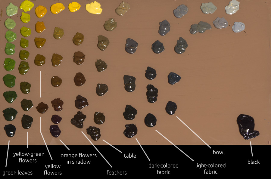
Use the image above of my finished palette as a general reference for how to lay out your color. When you go through the color mixing process yourself you will come up with your own steps and colors. Your steps do not have to be perfect, just avoid making them way too big. If you make your steps too small, it only means you are doing more work than you need to.
Beginning to Mix Colors in a Color Group
Once you have decided which color group to start with, you need to determine the darkest value in that color group. You will begin by mixing this darkest color, unless the darkest color is black, in which case you have should have already mixed it. Then paint a strip of this on your mixing palette somewhere.

Review the "Mixing Colors" video at the top of this page if you do not know how to begin mixing colors.
Note: If you are have any trouble at all with your color mixing, ask for help on the Draw Mix Paint Forum. Someone will be happy to help!
After you have mixed the darkest color in the color group, mix a color that is one step lighter in value than the darkest color. You will determine if your color is a good step by comparing it to the strip of paint you painted on your mixing palette (when you finished mixing your darkest step).
What is a good step? Below are some of the colors I mixed for my still life — I did not mix perfect steps and you don't need to mix perfect steps either. It is not critical that your steps are perfect, but do try to avoid making them too big or too small (this will make things easier for you later on when you begin to paint). Make note of what a good step looks like below.
Remember, you will always mix all the steps in every color group. Do not skip steps, even if you think a particular step is not in the color group — it is almost always there, though you may have to look really hard to find it. If you really explore by color checking throughout the color group, you will generally find every step.
Color Mixing Wheel
Below is a color wheel that will be helpful. Use it as a reference while you mix colors.
Gray and Brown
If you think a color looks too "gray", that means it is too blue. If you think a color looks too "brown", that means it is too red or too orangey-red. Remember this when you are checking your colors. Often you will look at a color and see that your color is too gray or too brown… simply remember that "too gray" means "too blue", and "too brown" means "too red".
How to Mix a Single Color
If you ever get stuck mixing colors, refer to the steps below and follow them to the letter:
- Mix a color on your mixing palette, making sure that it is at least a tablespoon or more of paint. Attempt to mix the color as best you can, but don't worry if you are unsure of what to mix — you will get there.
-
Once you have mixed a color, compare the color you have mixed with the stripe you painted of the previous color (the darker step before the one you are currently mixing). Ask yourself, "is this a good step?", and if the answer is no then darken your color or lighten it so that the step is about right. If the answer is yes, continue.
-
If the color you mixed is a good step (value), then check the color's tone. Do this by painting a small spot of the color onto your photograph so you can compare the paint color and the photo color. Use plenty of paint, but not so much that you are painting blobs that stick out from the surface of the photo. This is very important — there is no point even looking at the color unless it is being compared to a spot where the value of your paint is the same as the value of the color in your object. So you will need to continue to put spots on your photo until you can see that your paint spot is the same value as the color in the photo. Once you are sure the value matches, then and only then do you judge the tone.
Now ask yourself the six questions below. If you can not answer one question, go to the next until you can answer the question. You may need to ask yourself all six questions. The six questions are:- Which color is more red, the color on the color checker or the object?
- Which color is more orange?
- Which color is more yellow?
- Which color is more green?
- Which color is more blue?
- Which color is more purple?
- Make the adjustment to your color pile by adding the appropriate color. If your color needs to be more red, add red. On the other hand, if your color is too red, add the color on the opposite side of the color wheel (the opposite of red, for example, is green). Use your color wheel to guide you.
- Once you have adjusted your color be very sure to re-check your step. Sometimes when you add color to adjust the tone, you will also inadvertently alter the value as well, so you will need to re-check your step by comparing it to your last color stripe. If the value needs adjusting then you will need to lighten it or darken it until your step is a good step. Once you have confirmed that it is a good step, then and only then re-check the tone by comparing your paint to the photograph and ask yourself the six questions.
Repeat this process until you get a good color match. You are now ready to mix the next step in your color group.
Note: When you are mixing the darker colors, use burnt umber as your red instead of pyrrole rubine or permanent alizarin crimson. It is more opaque and easier to work with, and the colors you mix with burnt umber will blend better with other colors when you paint. Burnt umber is also much less expensive. Obviously there will be times when you must use pyrrole rubine (or permanent alizarin crimson), especially when mixing strong reds (like red roses or red lipstick). Purples will also need pyrrole rubine or permanent alizarin crimson.
Another Helpful Video on Color Mixing
In this video demonstration I lay out the very basic rules for matching one color to another:
next step →